
There’s been huge discussion on a lot of forums and socials about the cover art choices for the new ‘Now and Then’ Beatle single.


This post on Reddit (by PowerPlaidPlays) is an articulate argument for why it actually works:
“A lot of people have a lot of negative things to say about the new single art. I initially did not like it at first ether, but it’s grown on me and I thought a post defending it would be a good counterbalance to all of the “improved cover” mock ups lol.
The biggest thing I appreciate about it is how it stands on it’s own.
It reminds me of how The White Album was a deliberate departure from Sgt Pepper’s cover, or how Abbey Road lacked the band’s name on the front. It’s not rubbing the band’s legacy in your face or leaning too hard into nostalgia. We already have Anthology if you want references to their entire career, or the Red/Blue albums if you want the ‘Please Please Me’/’Get Back’ photos paired together. It’s not just a normal boring photo of the band like the ‘Real Love’ single got. It’s not focusing too much on John like the ‘Free as a Bird’ single did by using one of his drawings. The song has it’s own unique image.
I think the most it hearkens back to old Beatles imagery is the serif font (similar to the drop-T logo) and the color palate reminds me of Abbey Road, with the blue (like the sky), green (like the trees), grey (like the road), and white (like the crosswalk).
The back cover is where I think some more symbolism is present. With the “Then” being the I ‘Wanna Hold Your Hand’ photo, and the “Now” being a clock with 3 and 9, but missing 6 and 12. I think the assembled sculpture also is fitting for a song that is a mix of 1979, 1995, and 2023 recordings, with apparently some stuff sampled from a few other Beatles songs.
I also do like how it seems to be a painting and not digital typography. Looking at higher resolution images of it, you can see the canvas texture and paint imperfections.
Admittedly I am not in love with it, and probably like it more for the things it’s not, but I can appreciate it for being an interesting decision. I keep looking at it, and it keeps making me think. It’s not just an obvious “yep, it’s a Beatles single and it has a photo of the Beatles.”“
And this (from zosterpops) also on Reddit:
“To add to the interpretation, the angles are reminiscent of the covers on the Red & Blue comps and it has a decades-spanning quality to it with its colors, typography, and texture.
I think it’s also worth mentioning how the cover works as a minimalist design. It’s inspired paragraphs of both appreciative and unappreciative discussion on this sub. That’s always a hallmark of good art/design for me. Something that gets people talking about it.“
This make a lot of sense. Yes, it’s a very plain front cover but it has lots of references and room for interpretation.
As to the rear cover image, more information on the origins of the cute little clock image have come to light since the 7″, 10″ and 12″ records have landed in fan hands.
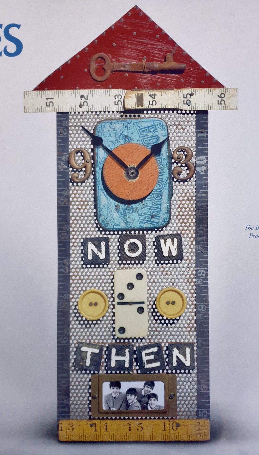
Inside the record sleeve is an insert with notes by John Harris which reveals the origins of the art piece shown:

(Thanks to @andrewdixonmusic for posting this info on Twitter).
So, it turns out this is an actual little clock owned by the Harrison estate, purchased by George in 1997. It was made by an Oregon artist named Chris Giffin, who is regarded as something of a local cultural treasure. She specialises in found object, assemblage and altered art.

“I create objects from materials that capture my eye, and that can be recycled materials or found objects. I make functional and sculptural and jewelry objects out of these materials that I collect. I try to take things that have had a past life and then give them a new life.”
Much of Giffin’s work involves metaphor, specifically concepts having to do with measurement, or man-made divisions applied to natural forms: “Time for me is a real metaphor, so I do make
a lot of clocks, and I have a lot of measurement objects in them. Because time is a measurement, and of course tape measures and rulers and protractors—all that kind of
stuff—to me is just the way we have chosen to decipher our need to organize our daily lives.”
What better way to depict “Now” and “Then”? You can see more of Giffin’s work on this Pinterest page. You get the feeling that the value of their pieces just went up 1000%!

Grrrrreat Insight !!! I Shall Ponder !!!
LikeLiked by 1 person
🙂
LikeLike
Wow! That is a lot of bending over backwards to find some abstruse interpretation that could possibly be relevant and insightful. The Ed Ruscha artwork is pretentious and seriously unremarkable. I agree with what it isn’t, but I seriously doubt Ruscha was concerned with all that Beatle baggage when he worked on the commission. Unlike Pepper or The White Album, this work adds nothing to the presentation. It’s depressing and prosaic. Kurt Vonnegut said it best: “A plausible mission of artists is to make people appreciate being alive at least a little bit. The Beatles did.” Rusha’s artwork? Not so much. As for the back cover, it’s fine. A bit nostalgic, but genuine and possessing a bit of history.
LikeLike
The domino itself going from 3 to 2 also. Fab fluke. I think it’s great. Both sides.
LikeLike
Thank you for making that connection regarding the domino piece on the clock! I guess that could also be seen as a loose Ed Ruscha connection too as he used a dice with 3 similar dots for the McCartney III cover.
LikeLike
The non cover of the single is insulting to the group and their final work together. It shows laziness, lack of any sort of artistic beauty, and could be out done by a kindergarten child with a crayon.
LikeLike
I didn’t want to read this article. Other defence posts went unconvincing to me. Glad I read it through. Well done Beatles Blog. I knew the clock story already, but I didn’t know the image was the back cover as I hadn’t opened my shipment yet. Thank You BB.
LikeLiked by 1 person