If I said the name Rick Ward to you, you’d probably reply, “Rick who??”
Which is interesting because if you’re a Beatle fan with even a half-decent collection you’ll definitely have at least five or six examples of his work amongst your vinyl, CDs and DVD’s.
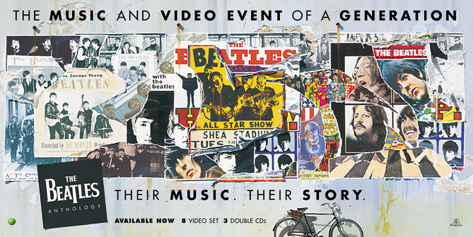
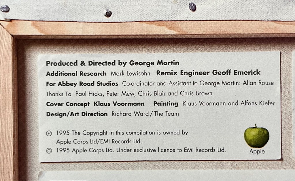
We’re all aware that long-time Beatle mate, bass player and artist Klaus Voormann (along with fellow artist Alfons Kiefer) painted the fantastic cover art for the Anthology series, but did you know the entire Anthology concept and packaging brief was the brainchild of a guy called Rick Ward?
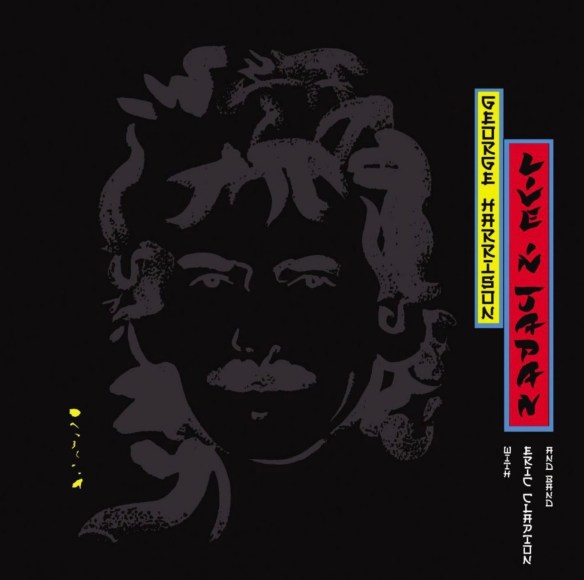
In 1995 Ward was working for The Team, a top London design and branding company. He’d already done some work for George Harrison, designing the sleeve and contents of his 1992 double LP, Live In Japan (now long out of print but soon to be re-issued on Dark Horse/BMG):
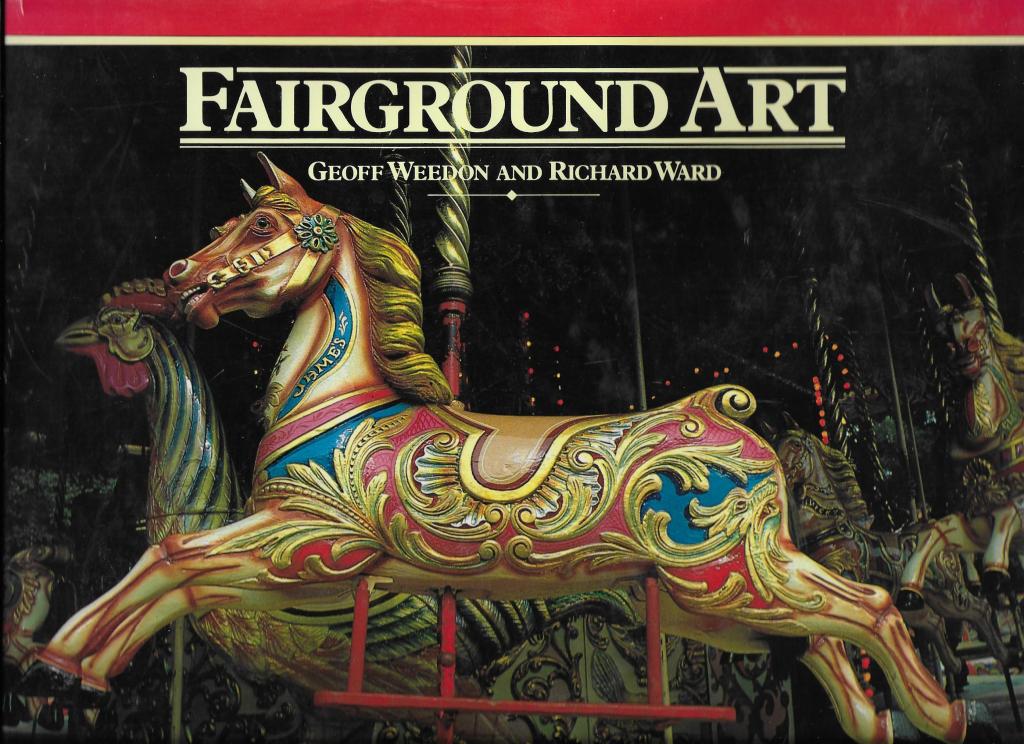
Ward had met George through a client of The Team, the F1 car designer Gordon Murray. They’d been working together on the graphics, marketing and launch of the McClaren F1 supercar. As we know, Harrison was a mad F1 racing fan and it turns out that he knew Murray who had given the Beatle a book for his birthday on the history of fairground art – co-authored by none other than Rick Ward:
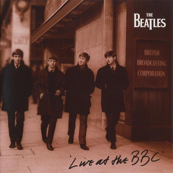
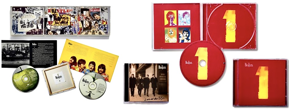
George obviously loved that book because he called Ward and invited him to visit Friar Park. The two subsequently became friends and before you know it he was designing the Live in Japan package. A year later it was George who suggested Ward might come up with the design for The Beatles Live at the BBC packaging. He was soon invited into Apple to discuss and produce concepts for what would be the band’s first new album of previously unreleased material since Let It Be:
Ward recounts a funny story behind the hand-written title of the front cover: “The concept was a fan’s photograph with an autograph on the front. I had found a great image, got the picture retouched, and then just wrote “Live at the BBC” in the corner. It was supposed to mimic the bootleg albums that were cropping up at the time. They instantly loved it, but we had to decide whose handwriting was going to be on the front. I asked Paul, George, Ringo and Yoko to take a pen and write “Live at the BBC” just like they were signing a photograph. I then printed all the versions out, randomly adding mine and Neil Aspinal’s to the mix. I then sent the options back to the four of them and asked them to choose their favorites. When they came back with their votes, I couldn’t believe it: It was mine!”
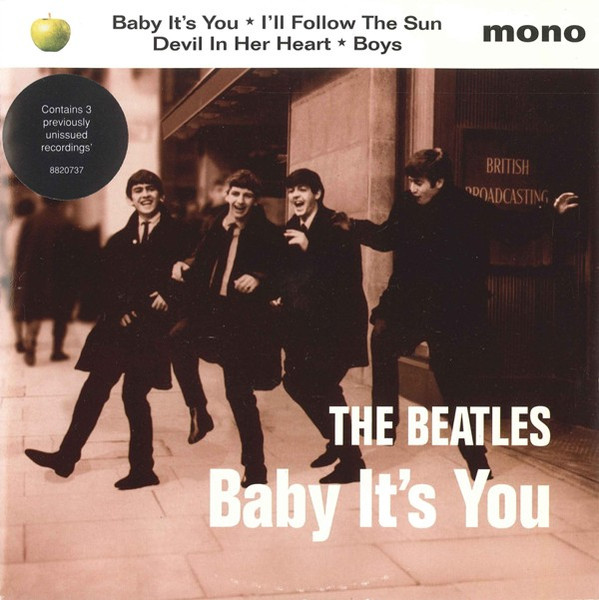
Ward also got involved in the cover for Baby It’s You, the four-song EP released in support of Live at the BBC which featured three additional previously unreleased songs:
So, another success. It proved worthwhile because in 1995 The Beatles and EMI started on Anthology, the largest music project ever attempted by the band: three triple albums plus a multi-part TV documentary subsequently released on VHS tape (and DVD) as boxed sets. Not to mention a book, all covering their entire recording career, released across every major format of the time. Anthology was to be a definitive statement, the band telling their own story and setting the record straight. The concept for it all, conceived by Ward, was an artist’s painting, a ‘masterpiece’ and a rediscovery of ‘their art’.
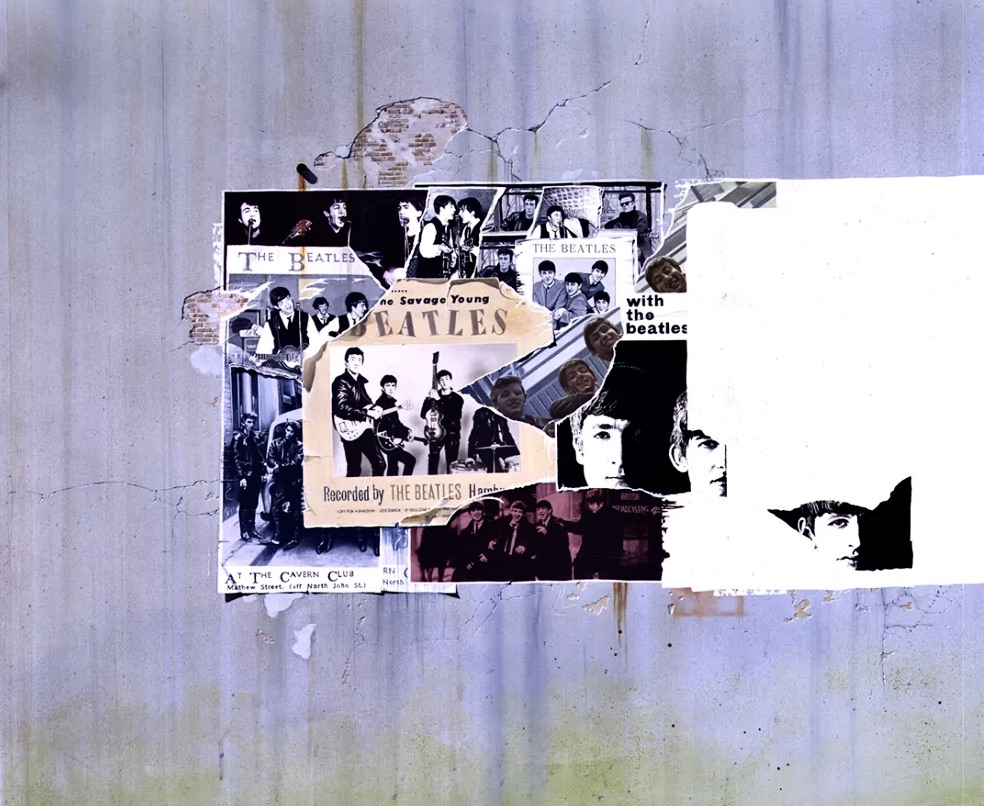
Last year when talking about the design Ward recalled: “I had always considered their music and lyrics as works of art, so that was my starting point. The idea was for the project to literally be a work of art that could be divided up into three sections that charted and reflected their career – giving equal presence to all four members…..To realise this, we invited six artists, each with their own creative connection to the band, to respond to the brief.”
Those artists were David Hockney, Peter Blake, Brian Grimwood, Humphrey Ocean, David Oxtoby and Klaus Voormann. Only five submitted their thoughts. Peter Blake (the artist behind the iconic Sgt Pepper‘s Lonely Hearts Club Band cover art) simply refused. He wasn’t going in a competition. They could either choose him outright, or not at all. Of the other five Ward recalls it was Voormann’s concept that immediately stood out. “It perfectly captured the album and importantly, it allowed us to work with pre-approved imagery, which was vital, because literally everything had to be unanimously approved by each individual Beatle before it could move forward.” Klaus later decided to take the idea further, transforming his collage into a painted work that retained its layered quality but added more depth.
“Together, we developed the vision by using the idea of a large billboard poster on the side of a fictitious concert hall they had played at from the beginning to the end of their recording career. It became both an artwork and a metaphor for their legacy.”
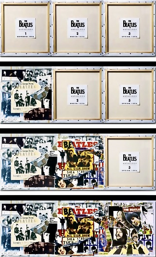
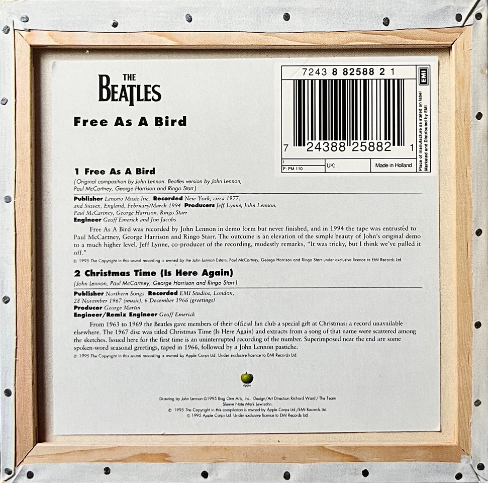
“A small but defining design touch came on the back covers. Since the concept revolved around a “work of art,” I chose to show the reverse of the canvas, as a teaser for the pre-release marketing. It gave the sense of seeing a masterpiece in progress, an artist’s work evolving before your eyes, while also serving as a teaser for what was to come. This gave Klaus much needed time, between each release date to then go on to do the second image, and then finally the third completed image.”
Very clever, but even so they worked right down to the strict deadline for each release to get the covers completed:
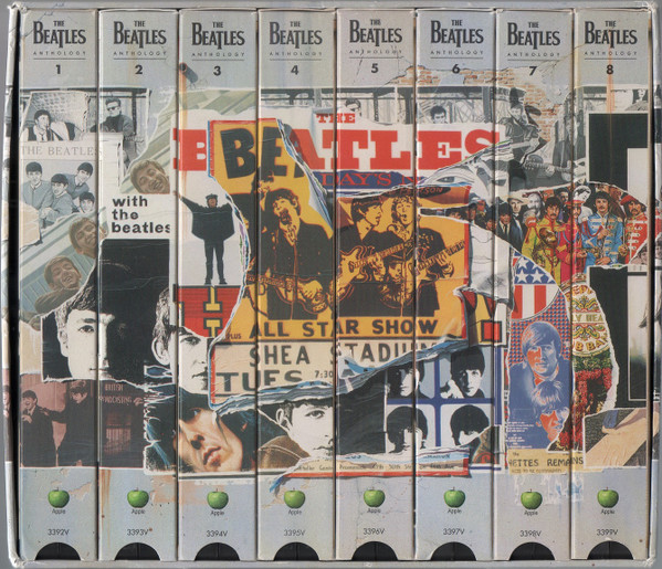
Ward also had to take into account all the different ways these images would or could be used. “It was extremely challenging to lay out due to the varying proportions of the different design formats like cassettes, 45s, 12″ LP covers, LaserDiscs, VHS covers, etc., and so on. I developed a grid matrix which we constantly laid over the rough visual to keep checking that it would fit every format, and that each of the four Beatles were equally represented.” The genius of this is well illustrated by how the individual spines of the VHS tapes present when on the shelf:
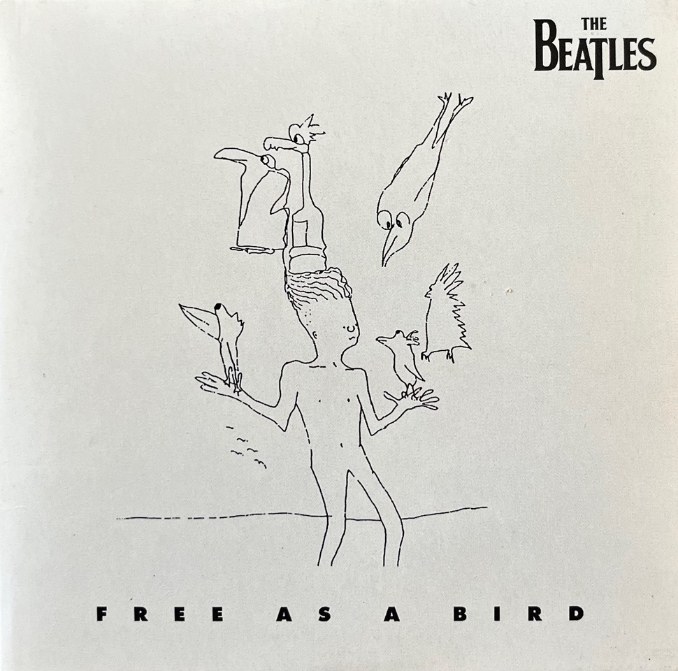
Ward was also involved in many of the Anthology spin-offs, like press kits and the quite substantial promo CD samplers for each Anthology album, not to mention the singles that came out for ‘Free As A Bird’ and ‘Real Love’. Each carried over elements of the original concept:
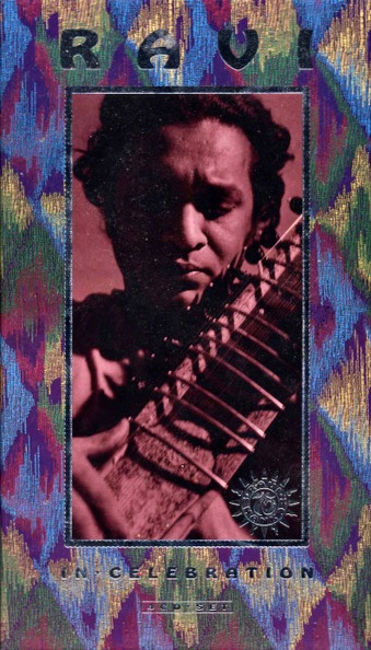
As is the way with these things, one thing lead to another. In 1996 Ward was also commissioned to design the Ravi Shankar retrospective compilation called In Celebration, a 4 CD box set co-produced by George Harrison:
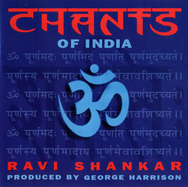
This was followed the next year by Ravi Shankar’s Chants of India, also produced by Harrison:
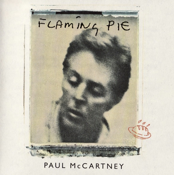
Interestingly, in 1997 Ward’s company The Team also designed the cover art and packaging for Paul McCartney’s Flaming Pie:
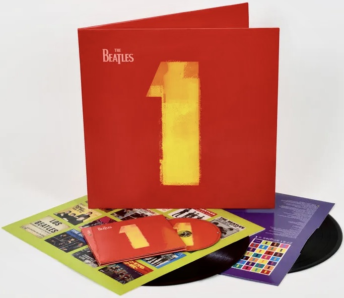
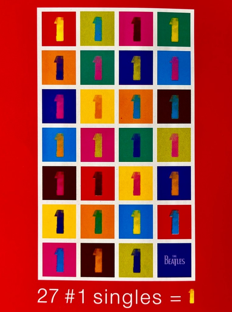
And then, in 2000, came another big one, probably the biggest – certainly from a sales perspective. Ward received a further commission from the Beatle camp to come up with ideas on how to present globally a new compilation of every Number 1 hit they’d had (all 27 of them) in an album simply to be called 1:
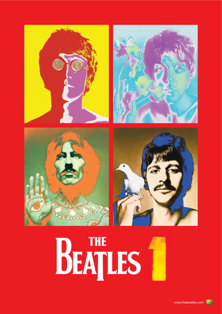
Speaking in PRINT Magazine in 2023 about the ideas he came up with Ward recalled: “I had always loved the graphic look of basic ticket printing for entry into dances in town halls, then we treated the bold “1” as a piece of graphic art, the “hero,” so to speak. So we kept it minimal, strong and simple. We obviously needed to have pictures of them somewhere in the album, and as the cover had turned quite pop art–ish, I was reminded of the ultimate iconoclastic photos Richard Avedon had taken of them in the ’60s for Look magazine, so I suggested using them.”
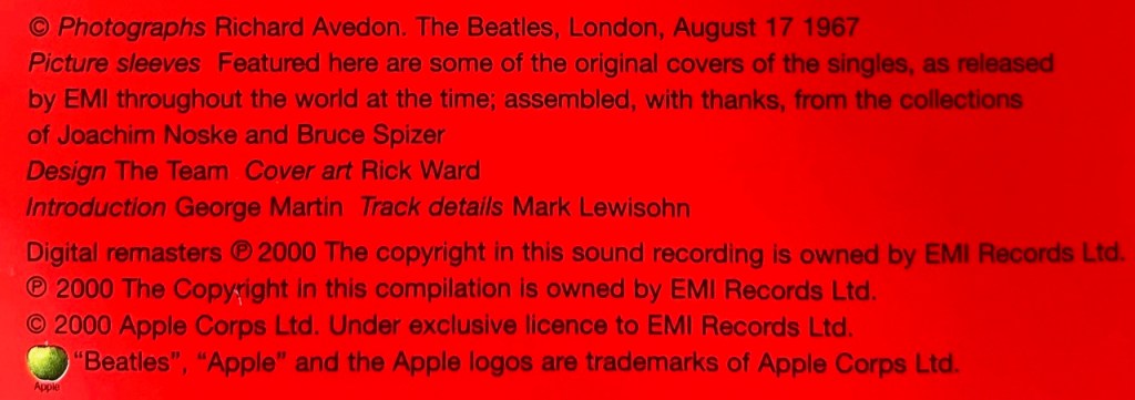
Inside the packaging was an absolute wealth of visual material for Beatle fanatics, including hundreds of picture sleeves from singles released around the world. There was also unique artwork and a common design theme which tied it all together as a musical and visual celebration of the band’s incredible success.
When asked which album design he was most happy with, Ward said, “I thoroughly enjoyed working on all of them, as they were each so different in what they were setting out to achieve and all had challenges to overcome. There is no one album that’s my favorite, and I learned so much doing each one. It was always interesting, stimulating and very challenging. Live at the BBC, being my first one, was initially quite overwhelming; being invited to design an album cover for the greatest band in the world was a bit unreal. But upon reflection, the fact that they were asking me meant that they had enough respect for me and my work, and so I was able to accept it, and take it as a compliment, and for the amazing opportunity it was.”
From time-to-time we like to bring you the background stories like highlighting some of the lesser-known players who helped The Beatles (either as a group or as solo artists) to extend their music through the art, design or photographs created for record covers, stage designs, tour programs and the like. You can find some more of those stories here:

when talking about the Beatles Anthology albums, I wished that Ward had given details on the joke they did on Pete Best when his image was replaced by a picture of Ringo on the album cover
LikeLiked by 1 person