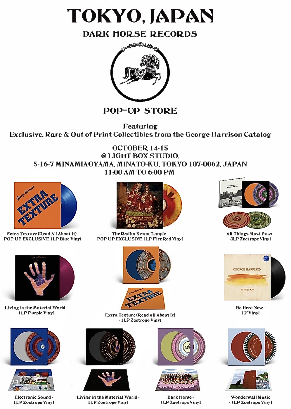
Dark Horse Records has announced just what will be on sale at its pop-up Friar Park x Niwaki x Dark Horse in Tokyo this week (October 14-15).
To celebrate the launch of the Friar Park x Niwaki collection on October 12, a two-day-only pop-up will be held at Light Box Studio in Tokyo. This pop-up store will feature the limited edition collection of Friar Park x Niwaki Japanese garden tools, workwear and accessories, along with a selection of rare out-of-print titles and collectibles from Dark Horse Records:
There are two pop-up store exclusive colour vinyls: Extra Texture in blue, and The Radha Krsna Temple in “fire red” which look interesting, plus Living in the Material World on purple vinyl – previously only available as a George Harrison Store exclusive when the 50th anniversary editions of that album came out in 2024.
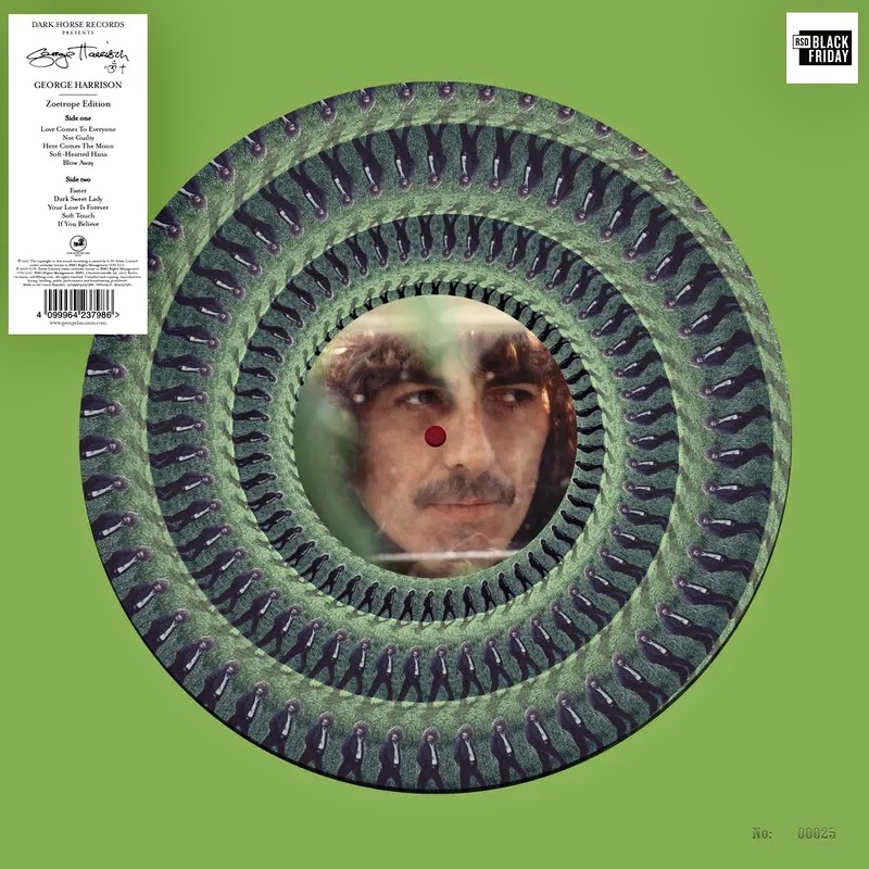
The others are re-issues of all six Record Store Day Zoetrope vinyls released so far, plus ‘Be Here Now’ a fairly rare 12″ single that came out for Record Store Day 2025. This has George performing the song on one side and Beck giving his interpretation on the other.
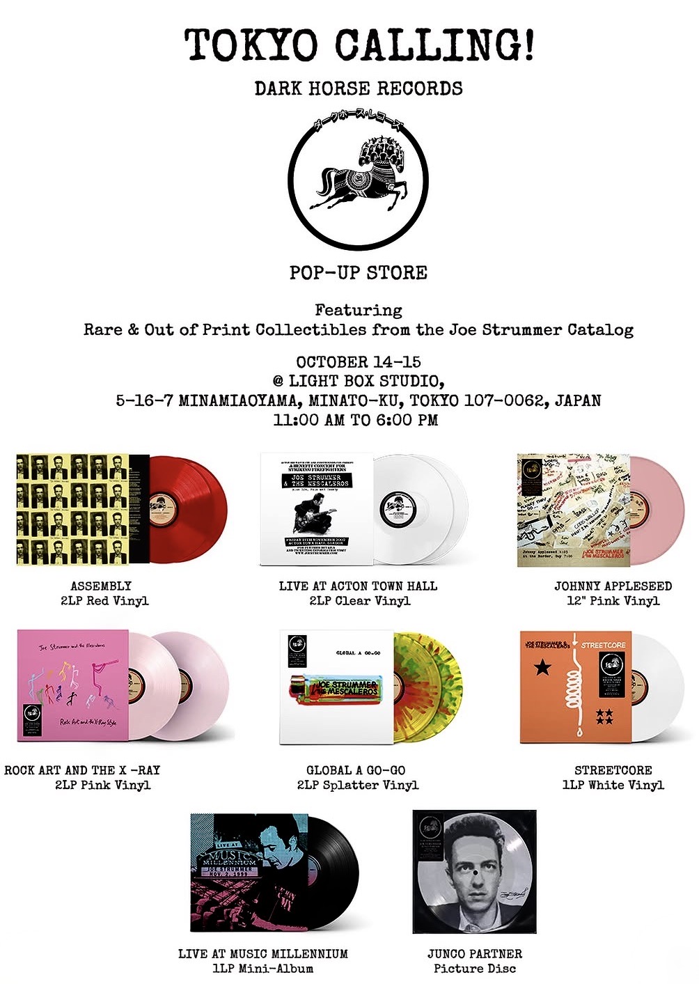
And Dark Horse has just posted a second list of titles that will be available at the pop-up – this time the focus being on Joe Strummer:
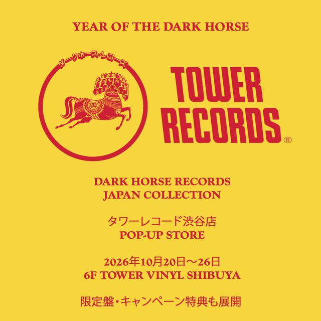
Its our understanding that these Strummer and the George Harrison LPs will also be available at a second, limited-time pop-up store in Tokyo. It will be on the 6th floor of Tower Records, Shibuya from October 20 to 26.
Tower Records will be the main launch site for 13 titles (11 from George Harrison and 2 from the Traveling Wilburys) which are newly remastered and being released as limited SHM-CD/mini-LP editions. In addition, three of George’s LPs — All Things Must Pass, Living in the Material World and Cloud Nine — will be released simultaneously on the super-high-end “100% Pure” 45rpm vinyl format. Not only that, Dhani Harrison will be at Tower Records Shibuya on 20 October to give a talk, meet fans and sign CDs and an exclusive Japanese red vinyl edition of Dragonflies, the album he recently released with Nigel Godrich.
Oh to be in Tokyo and have the ability to drop into either the Light Box Studio or Tower Records Shibuya.
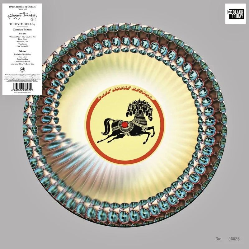
The only Beatle-related action comes from Dark Horse Records. They’re continuing the quest to slowly release the whole of the George Harrison back-catalogue as Zoetrope picture discs. The next two installments will be Thirty Three and 1/3 from 1976:
Both are limited editions and come in numbered die-cut jackets. They should also include inserts with cover art and credits and a small Zoetrope viewing instruction sheet. Both are limited to 2900 copies in the US, and probably the same again for the ROW.
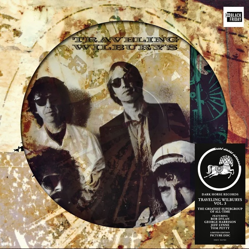
Dark Horse is soon to re-issue the Traveling Wilbury back-catalogue, first as SHM-CD’s in Japan on 21 October, and then on black vinyl on 23 October worldwide. For RSD Black Friday they’ll issue the group’s second album, Traveling Wilburys Vol.3, as a picture disc.
Dark Horse says “…this is the perfect companion piece to the 2018 picture disc release of ‘Vol. 1’.” The picture disc will be available exclusively for RSD Black Friday only at participating stores. 2,500 copies in the US.
[BTW, that Japan re-issue campaign will be associated with a whole lot of activations and collaborations in Tokyo. Check out the Dark Horse news page for more.]
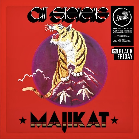
As has been the case for the last few Record Store Days, Dark Horse has been working its way through the Yusuf/Cat Stevens back-catalogue too. This time it’ll be Majikat Earth Tour 1976.
This is a double LP on black vinyl and comes in a lenticular cover. Just 1,050 copies for the US (UK figures unknown) so this will be harder to get.
And that’s about it this time around.
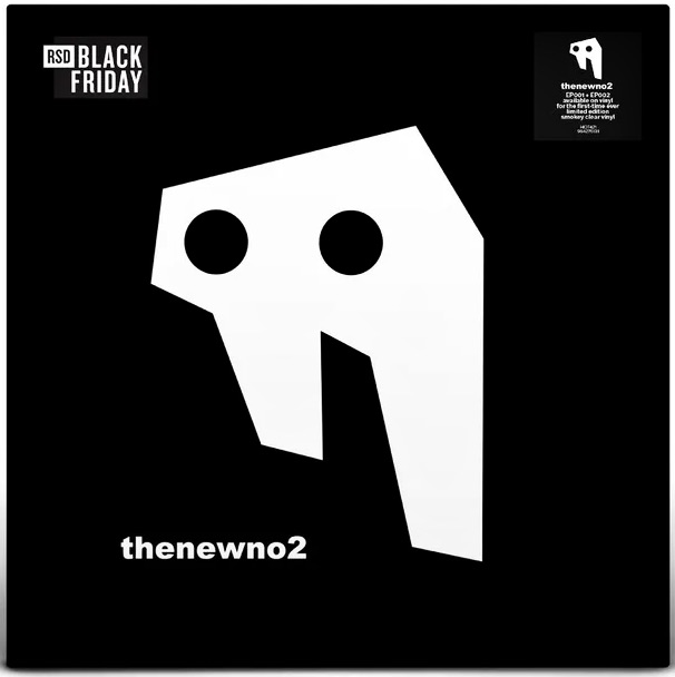
Those of you who collect Dhani Harrison will be interested to pick up an LP by his band, thenewno2.
For RSD Black Friday he’s put together the band’s first two EPs, ep001 & ep002, collected on a smokey clear colour LP. Newly remastered and available on vinyl for the first time ever, this limited edition release sees their debut EP on side 1, and sophomore EP on side 2.
Record Store Day Black Friday is on Friday, 27 November.
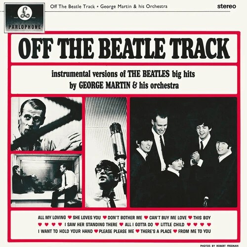
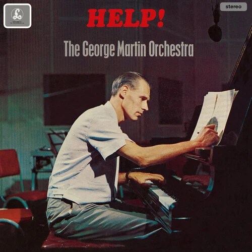
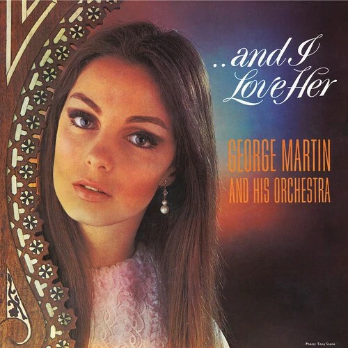
Rhino/Parlophone have announced the re-issue of three long-out-of-print George Martin & His Orchestra titles.
Off The Beatle Track was the first in a series of orchestral releases by George Martin and the first ever release under his own name. Originally released in 1964 at the height of Beatlemania, it was supported by the band and has liner notes written by John Lennon. Original copies of this vinyl are now in high demand due to its relatively limited release originally. Overseen by Martin’s son Giles, Off The Beatle Track has been faithfully remastered from the original master tapes, replicating the original release.
Help! was released the following year in 1965 and was the second release in the series. Featuring instrumental arrangements of Beatles songs, this reissue is true to the original UK release. (The original US release tracklisting omitted “Bahama Sound” and used some of the track working titles like ‘Auntie Gin’s Theme’ (I’ve Just Seen a Face), ‘That’s A Nice Hat’ (It’s Only Love) and ‘Scrambled Egg’ (Yesterday). The record came at a time when orchestral music had begun to embrace the sound of beat music – something it had initially dismissed as a ‘noisy’ genre, dismissing its integrity entirely. As Beatlemania grabbed hold of the world in the early 60s, and with respected ‘high-brow’ newspapers such as The Times of London giving serious analysis of Lennon and McCartney’s song writing, attitudes began to shift. This 2026 re-issue is also overseen by Giles Martin.
…And I Love Her dates from 1966 and is regarded by some as George Martin’s best instrumental project. Featuring his signature “Studio 2 Stereo” sound, which brought a lush, easy-listening sophistication to several popular hits of the mid-60s. Unlike the other two re-issues, this album not only has orchestral Beatles interpretations but Petula Clark’s ‘Downtown’, The Righteous Brothers’ ‘You’ve Lost That Lovin’ Feeling’, as well as the original Martin composition ‘All Quiet On The Mersey Front’, a track he wrote for the Ferry Cross The Mersey soundtrack.
These three interesting re-issues are out on CD or 140g vinyl on November 6. They’ll also be available on streaming platforms globally for the first time.
After a solid start – way back in 2016 – the Yoko Ono reissue program came to an abrupt halt in 2019. It’s now been 7 years since we’ve had anything.
Back then the promise was 11 albums in all. They were to be reissued on LP, on CD and for the first time as digital downloads. The plan was to do this in three distinct groups:
1st group: Unfinished Music No. 1: Two Virgins (1968) Unfinished Music No. 2: Life With Lions (1969) Yoko Ono/Plastic Ono Band (1970)
2nd group: Fly (1971) Approximately Infinite Universe (1973) Feeling the Space (1973) A Story (1974)
3rd group: Season of Glass (1981) It’s Alright (I See Rainbows) (1982) Starpeace (1985) Unfinished Music No. 3: Wedding Album (1969)
And that release plan all began to happen. There was even a promo video to officially kick things off:
Group one materialised in late 2016. Then group two (except for A Story) was issued across 2017. Then came a two year hiatus until Unfinished Music No. 3: Wedding Album suddenly appeared in all its box-set glory in 2019, the first release of group three.
And then, for about seven years, it all went very, very quiet. Until now.
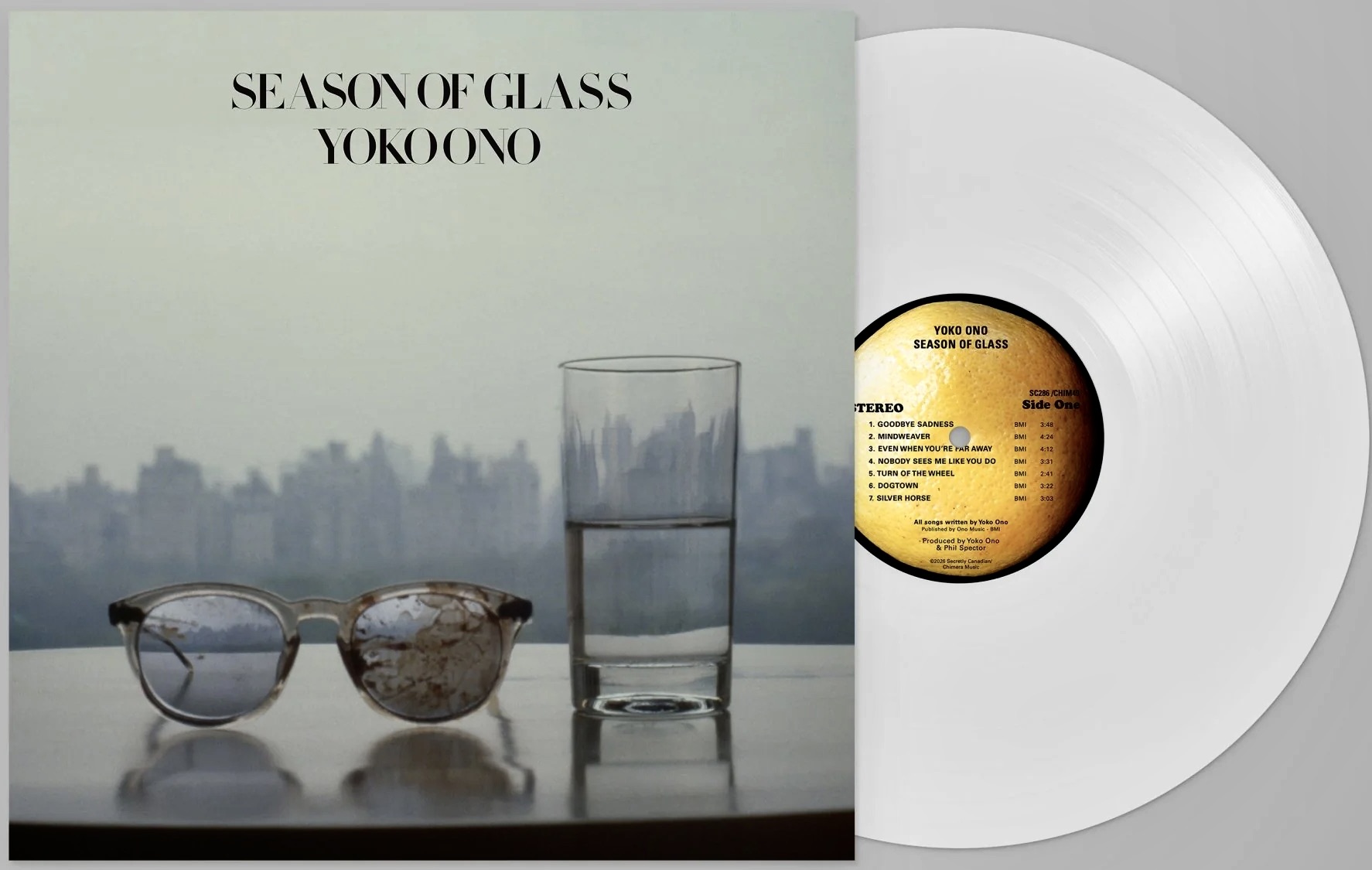
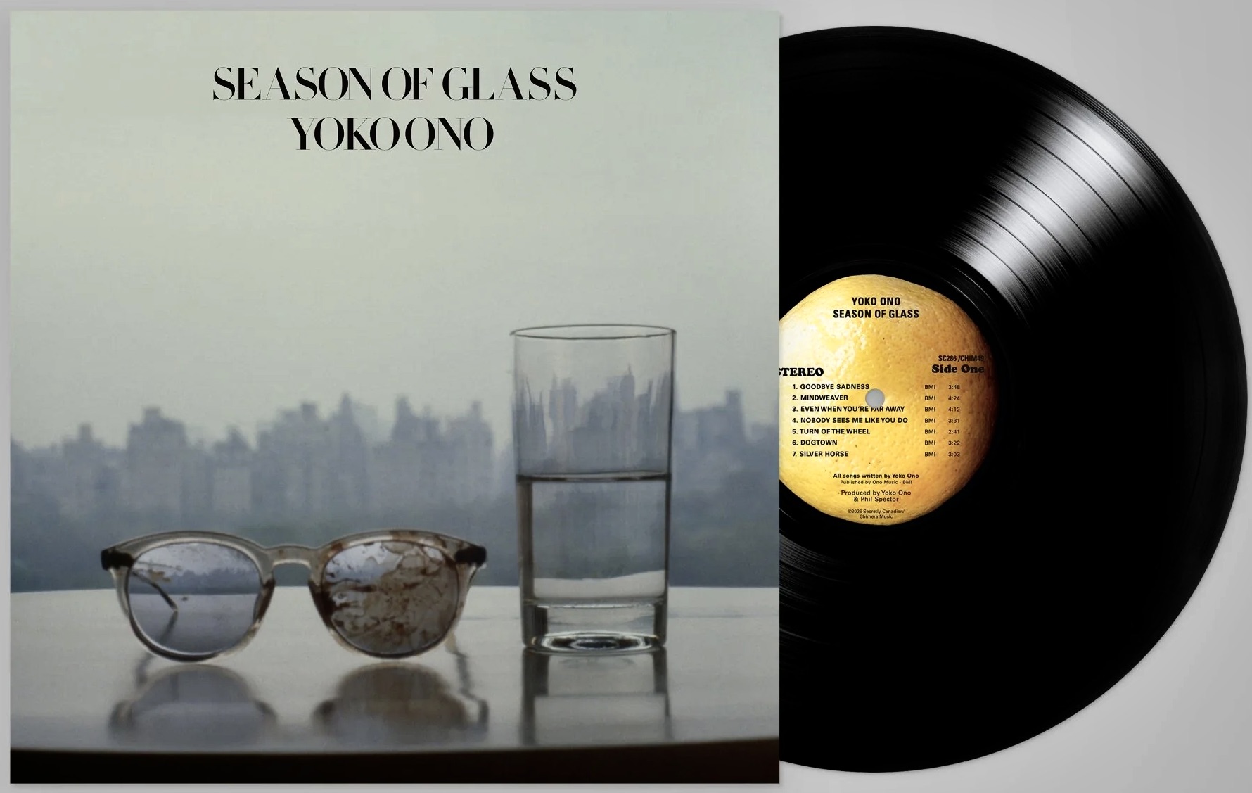
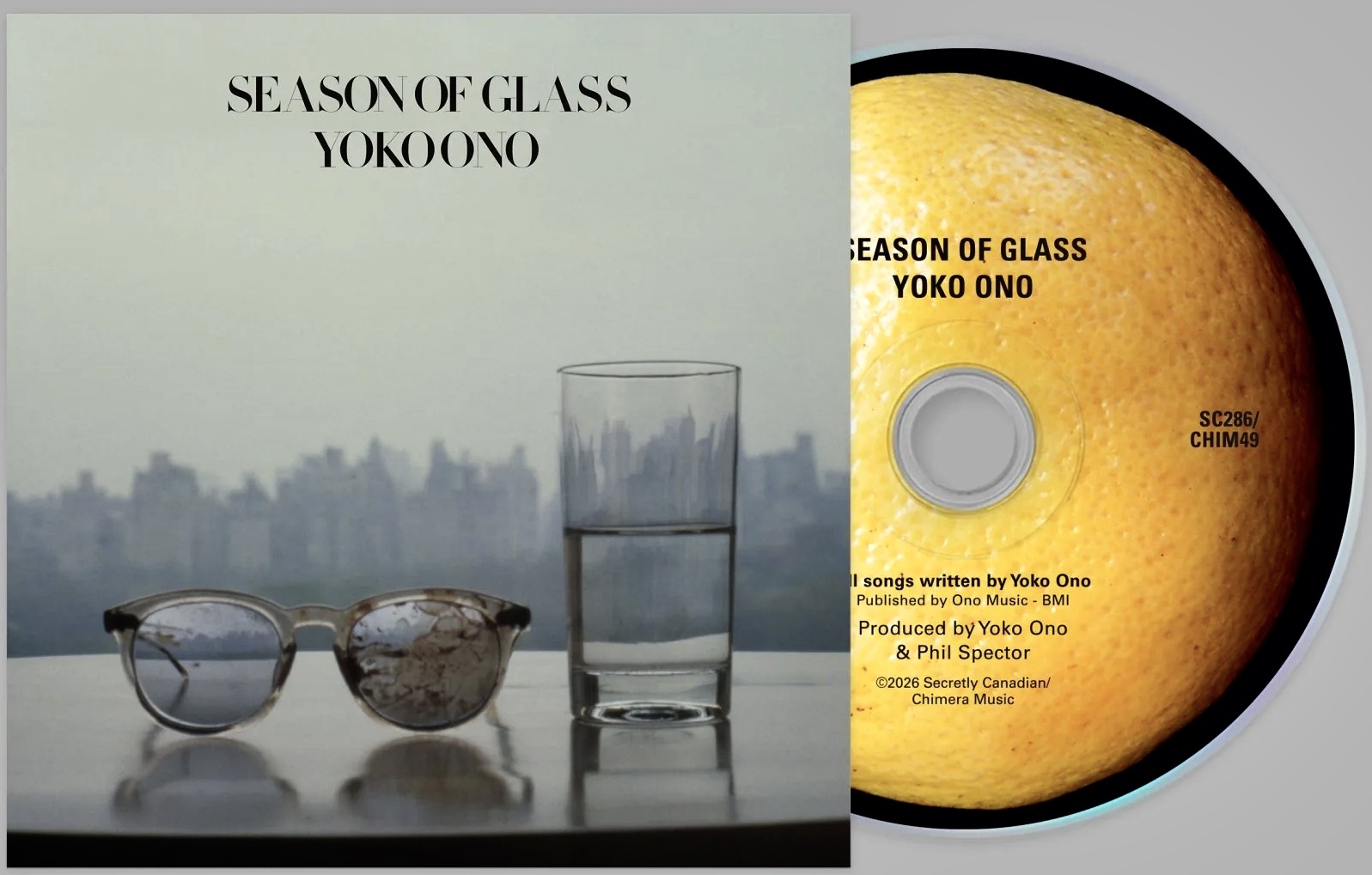
Season of Glass has just been released and, like each of its predecessors, it comes on limited edition white vinyl, on black vinyl, and on CD. All the artwork is faithfully reproduced but only the CD comes with bonus material (vinyl buyers used to get digital downloads of the bonus tracks, but no longer it seems):
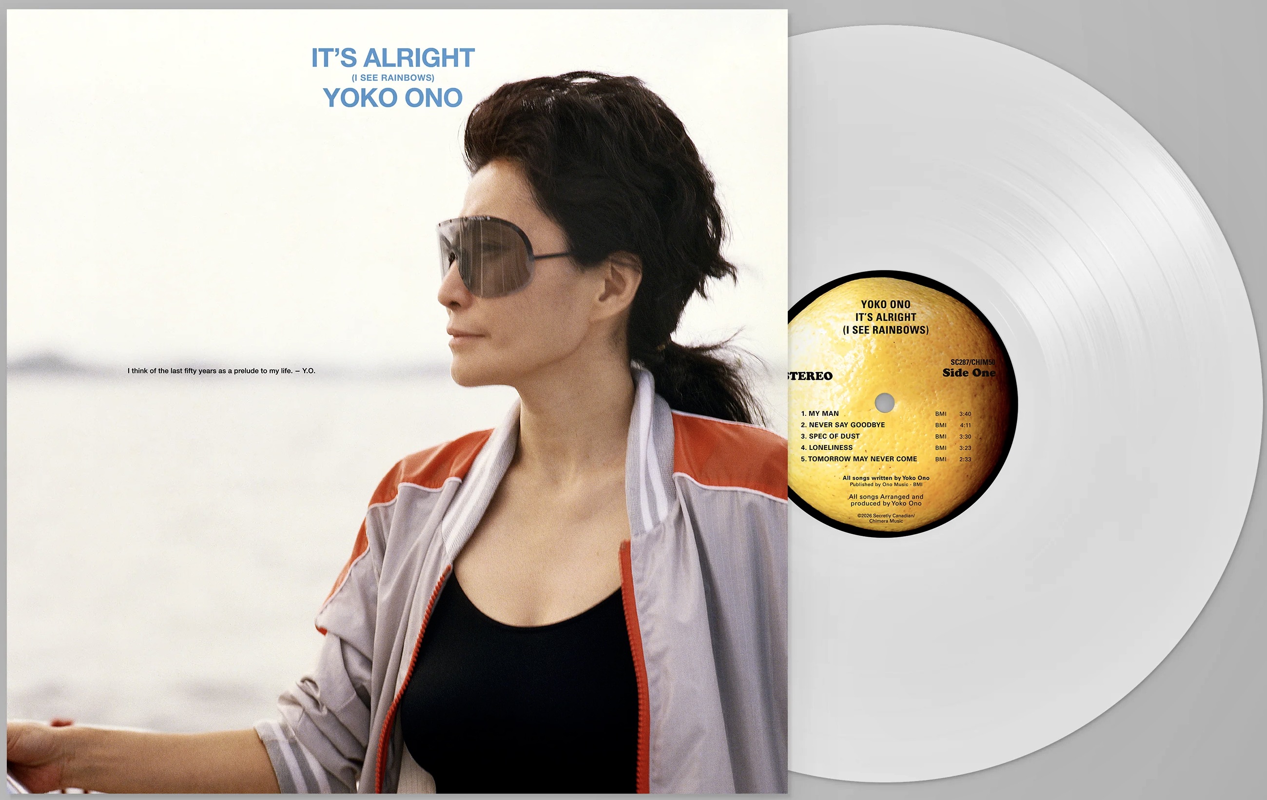
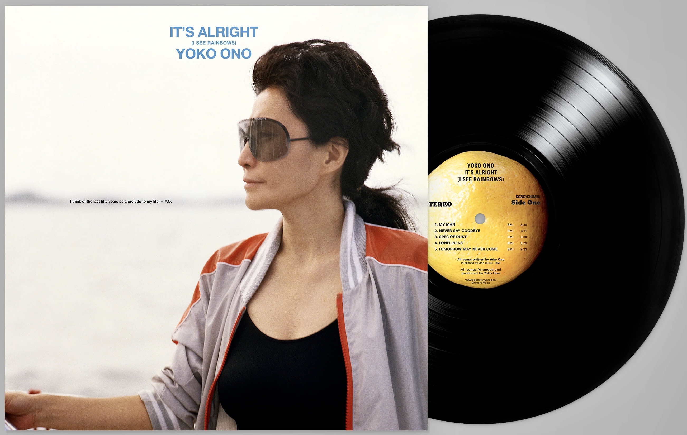
And today an email from Secretly Canadian/Chimera Music popped into our inbox alerting us that on September 18 It’s Alright (I See Rainbows) is set to follow quickly on the heels of Season of Glass. It is available for preorder now:
So that begs the question – are A Story and Starpeace soon to follow? Hope so.
It hasn’t even been released yet but quite a bit of work is being done by fans to identify the source of every image seen on the striking collage that fills the inside of the newly announced gatefold edition of Paul McCartney’s forthcoming Boys of Dungeon Lane LP:
There’s also a cassette which includes the same collage as a fold-out print and, in what’s turning into a big crowdsourced research project, fans from around the world are turning amateur detective and contributing to a special “Collage” Tumblr page set up by @bodl-gatefold.
The Tumblr page says: “We’re trying to source all the photos that went into this collage. If you think you’ve spotted one, send us an ask with a screenshot of the section where it appears, and a copy of the photo. The more info you can provide with your photo the better, but if you don’t know anything about where it was taken or even who’s in it, that’s find, send it!”
Here’s the collage (click the image to enlarge):
An email announcing the new gatefold edition says this “…screen‑printed collage is made from over 100 archive images, including previously unseen photography from Paul’s personal archive.”
So, here’s the artwork showing with red marks all the images @bodl-gatefold has identified so far:
As you scroll through the Tumblr page you’ll see examples of each of them – and there are a lot! The collage image is shown, and then the original source photo – usually (where known) with a time and place the original image was taken. The two below for example come from a hitchhiking trip Paul and George’s made in August, 1959:
There are many, many more great discoveries.
One thing that’s also immediately obvious, apart from the all the people, is that there’s a lot of bird images used throughout the collage. This helps explain the many bird references and little bird emojis in the current marketing teaser campaign. For example:
From what we can tell the album is deeply nostalgic and young Paul was once a very keen birdwatcher. Turns out that all the bird images on the collage come from The Observer’s Book Of Birds (which Paul has several times mentioned owning), plus two other books Coloured Figures of the Birds of the British Islands and The Birds of the British Isles and Their Eggs. So the Tumblr investigators have obviously been pouring over these. Here’s a detail example of the depth of the detective work being done just to identify the birds in the collage (again, click the image to see a larger version):
It seems that the making of this complex artwork for the gatefold was one of the reasons the release has been slightly delayed.
Back in March Paul’s brother, Mike McCartney posted a message on X leaking the title of the album and it’s front cover logo – a British street sign. He said that the album artwork was designed by his son Josh McCartney, Paul’s nephew.
Then a member of the Steve Hoffman Music Forum said he’d attended a screening of the Wings film, Man On The Run where Paul’s manager, Scott Rodger was a special guest. Rodger did a brief Q&A following the film and said, “There will be new Paul music in 2026. The record is done. The only reason it’s not out already is Paul took his time with the artwork.”
This collage is reminiscent of the collage poster that came with the White Album and has the potential to stand as a landmark piece of imagery, a permanent tribute to Paul’s amazing past.
McCartney’s Instagram and other socials have been carrying a short “behind the scenes” video of the collage being created. The artist who is making the collage is Kate Gibb:
The old addage “when you’re on a good thing, stick to it” comes to mind today as Ringo Starr announces the release of his second album with T Bone Burnett as producer – due out on April 24.
It’ll be called Long Long Road and it follows on from last year’s well-received Look Up, a welcome return to the country/Americana style that Ringo, and his audience, are very comfortable with. Under the direction of Burnett, Ringo is having something of a late career revival and reaching new audiences.
Recorded in Nashville and Los Angeles, the 10-song album features collaborations with Sheryl Crow, Billy Strings, Molly Tuttle, Sarah Jarosz, and St. Vincent.
And a CD in a good old-fashioned plastic jewel case:
Talking about the new album Ringo says “I’m blessed to have T Bone in my life right now and working with me on these records. After we did the last record, which I love listening to, this one just sort of happened. I like to say sometimes I make the right moves, like you can go left or right at any point, and one of the right moves was hooking up with T Bone for Look Up, and now for this one, which I’m calling Long Long Road, because I’ve been on a long long road.”
Renowned music photographer (and good friend of Ringo’s) Henry Diltz shot the album cover, as well as additional photos for the album packaging. If you don’t think you’ve seen his work before, it’s almost certain that you have! Check out the link above to his official page. Since the 1960s he’s been snapping rock royalty. His photographs of The Doors, Joni Mitchell, Crosby, Stills & Nash, Neil Young, James Taylor, Paul McCartney plus countless others have graced more than 250 album and magazine covers.
If I said the name Rick Ward to you, you’d probably reply, “Rick who??”
Which is interesting because if you’re a Beatle fan with even a half-decent collection you’ll definitely have at least five or six examples of his work amongst your vinyl, CDs and DVD’s.
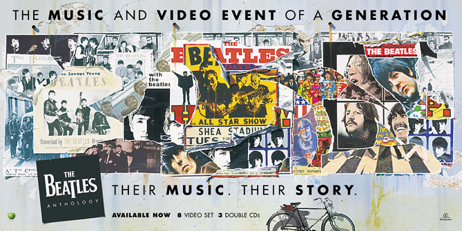
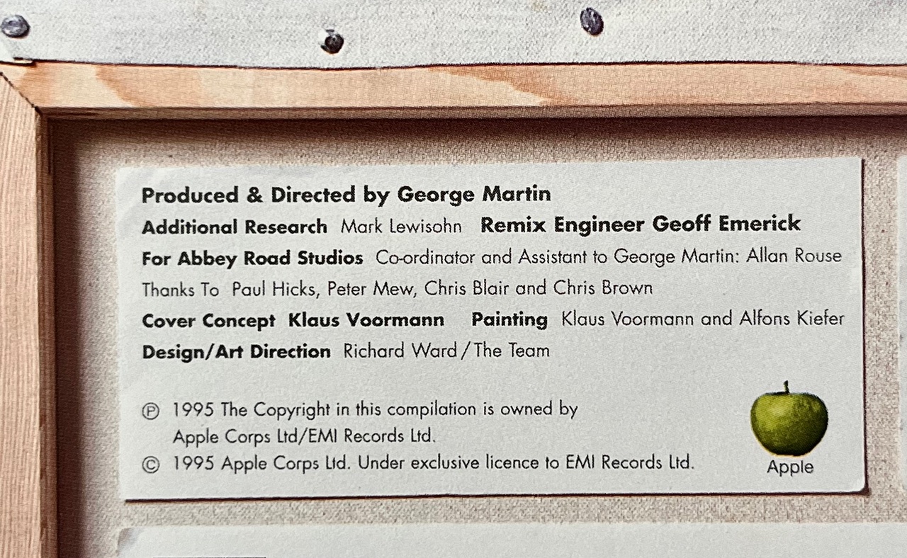
We’re all aware that long-time Beatle mate, bass player and artist Klaus Voormann (along with fellow artist Alfons Kiefer) painted the fantastic cover art for the Anthology series, but did you know the entire Anthology concept and packaging brief was the brainchild of a guy called Rick Ward?
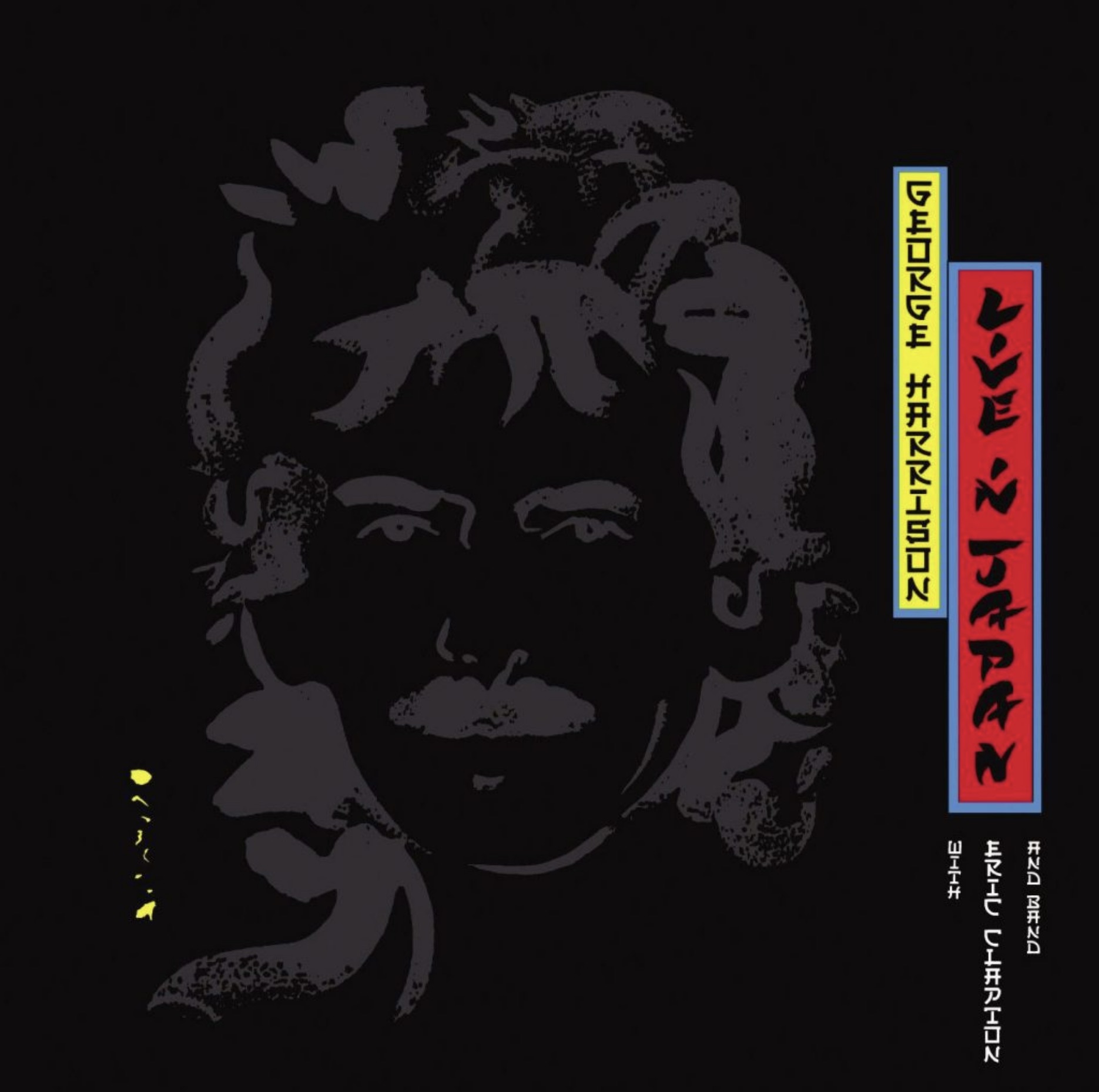
In 1995 Ward was working for The Team, a top London design and branding company. He’d already done some work for George Harrison, designing the sleeve and contents of his 1992 double LP, Live In Japan (now long out of print but soon to be re-issued on Dark Horse/BMG):
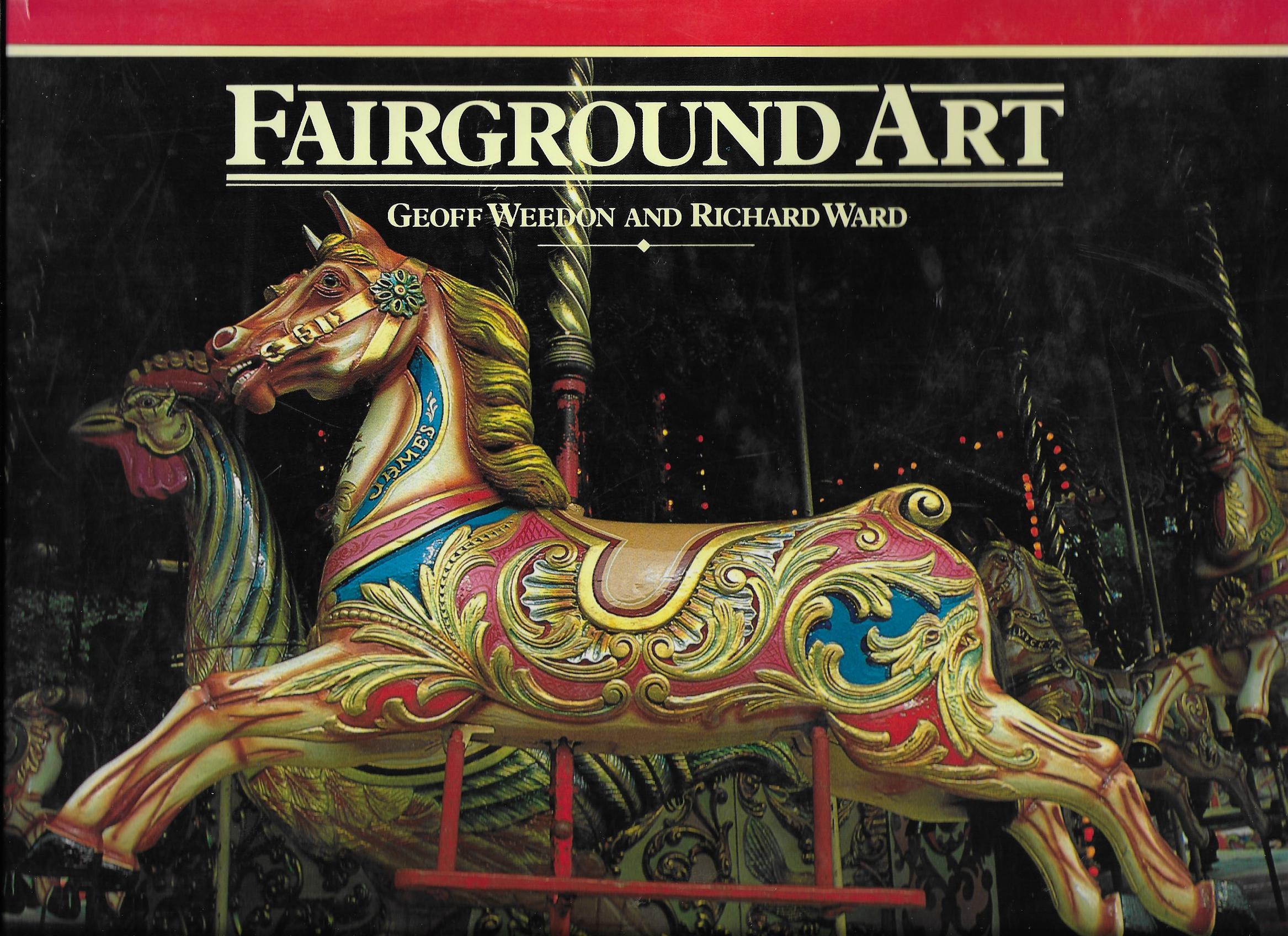
Ward had met George through a client of The Team, the F1 car designer Gordon Murray. They’d been working together on the graphics, marketing and launch of the McClaren F1 supercar. As we know, Harrison was a mad F1 racing fan and it turns out that he knew Murray who had given the Beatle a book for his birthday on the history of fairground art – co-authored by none other than Rick Ward:
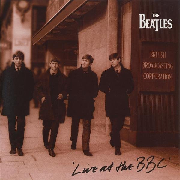
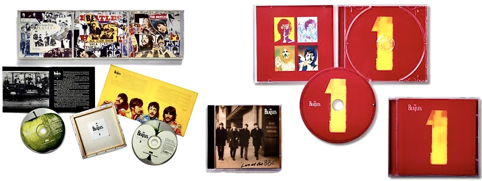
George obviously loved that book because he called Ward and invited him to visit Friar Park. The two subsequently became friends and before you know it he was designing the Live in Japan package. A year later it was George who suggested Ward might come up with the design for The BeatlesLive at the BBC packaging. He was soon invited into Apple to discuss and produce concepts for what would be the band’s first new album of previously unreleased material since Let It Be:
Ward recounts a funny story behind the hand-written title of the front cover: “The concept was a fan’s photograph with an autograph on the front. I had found a great image, got the picture retouched, and then just wrote “Live at the BBC” in the corner. It was supposed to mimic the bootleg albums that were cropping up at the time. They instantly loved it, but we had to decide whose handwriting was going to be on the front. I asked Paul, George, Ringo and Yoko to take a pen and write “Live at the BBC” just like they were signing a photograph. I then printed all the versions out, randomly adding mine and Neil Aspinal’s to the mix. I then sent the options back to the four of them and asked them to choose their favorites. When they came back with their votes, I couldn’t believe it: It was mine!”
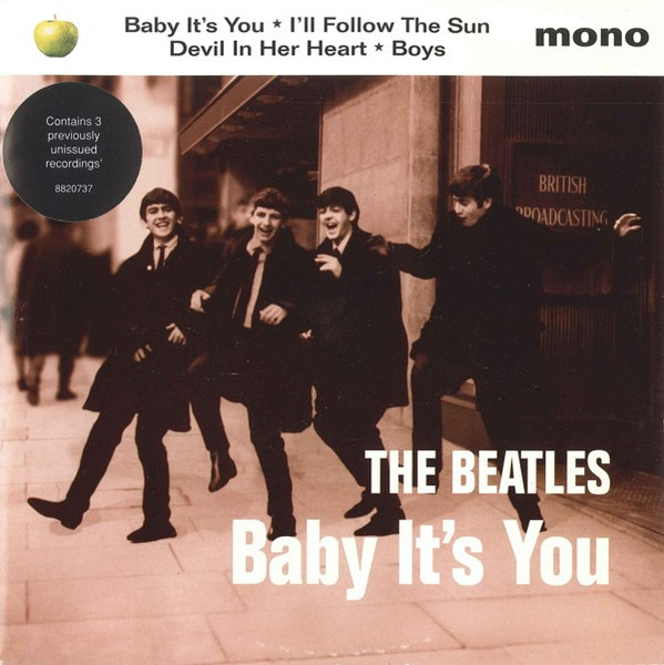
Ward also got involved in the cover for Baby It’s You, the four-song EP released in support of Live at the BBC which featured three additional previously unreleased songs:
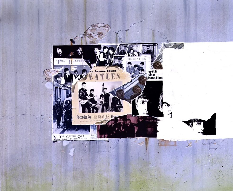
So, another success. It proved worthwhile because in 1995 The Beatles and EMI started on Anthology, the largest music project ever attempted by the band: three triple albums plus a multi-part TV documentary subsequently released on VHS tape (and DVD) as boxed sets. Not to mention a book, all covering their entire recording career, released across every major format of the time. Anthology was to be a definitive statement, the band telling their own story and setting the record straight. The concept for it all, conceived by Ward, was an artist’s painting, a ‘masterpiece’ and a rediscovery of ‘their art’.
Last year when talking about the design Ward recalled: “I had always considered their music and lyrics as works of art, so that was my starting point. The idea was for the project to literally be a work of art that could be divided up into three sections that charted and reflected their career – giving equal presence to all four members…..To realise this, we invited six artists, each with their own creative connection to the band, to respond to the brief.”
Those artists were David Hockney, Peter Blake, Brian Grimwood, Humphrey Ocean, David Oxtoby and Klaus Voormann. Only five submitted their thoughts. Peter Blake (the artist behind the iconic Sgt Pepper‘s Lonely Hearts Club Band cover art) simply refused. He wasn’t going in a competition. They could either choose him outright, or not at all. Of the other five Ward recalls it was Voormann’s concept that immediately stood out. “It perfectly captured the album and importantly, it allowed us to work with pre-approved imagery, which was vital, because literally everything had to be unanimously approved by each individual Beatle before it could move forward.” Klaus later decided to take the idea further, transforming his collage into a painted work that retained its layered quality but added more depth.
“Together, we developed the vision by using the idea of a large billboard poster on the side of a fictitious concert hall they had played at from the beginning to the end of their recording career. It became both an artwork and a metaphor for their legacy.”
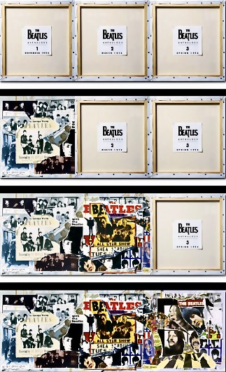
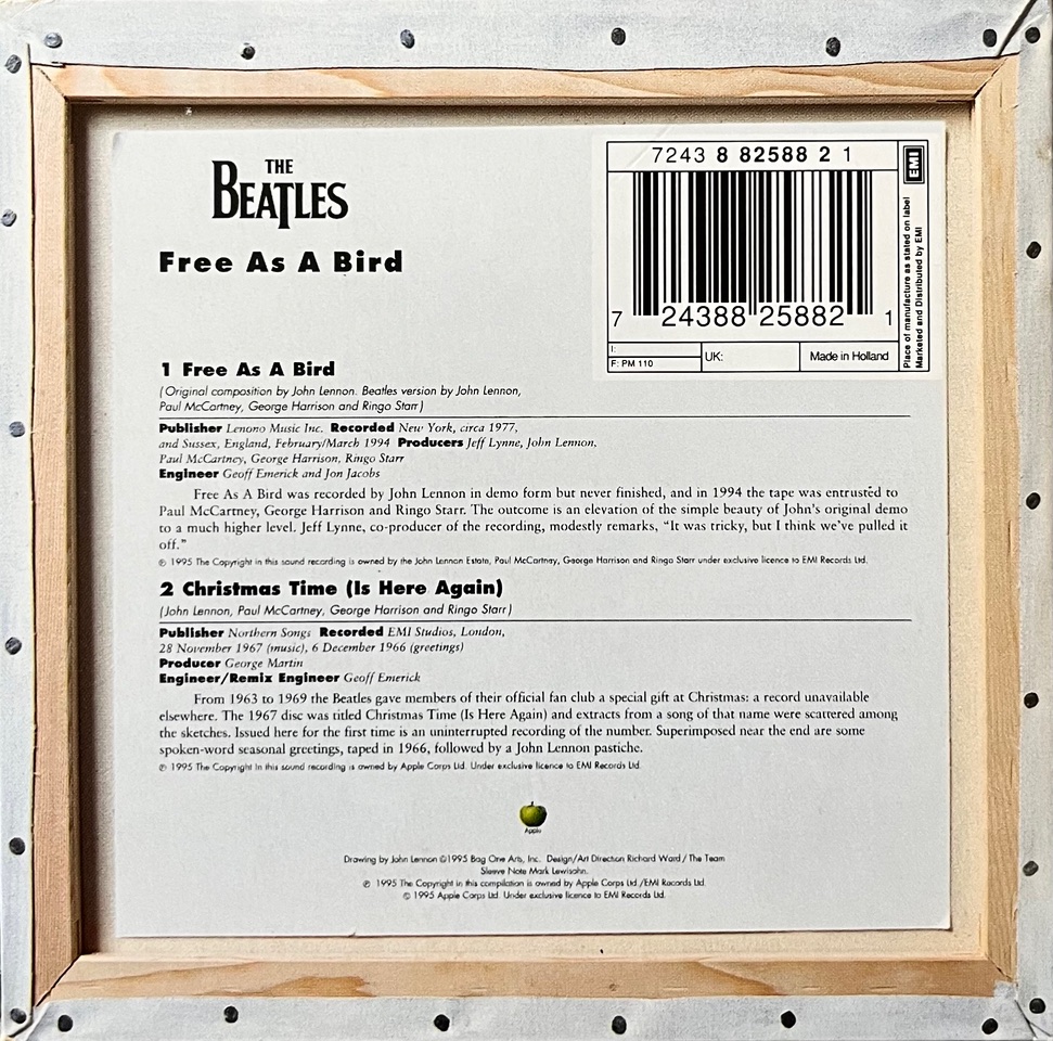
“A small but defining design touch came on the back covers. Since the concept revolved around a “work of art,” I chose to show the reverse of the canvas, as a teaser for the pre-release marketing. It gave the sense of seeing a masterpiece in progress, an artist’s work evolving before your eyes, while also serving as a teaser for what was to come. This gave Klaus much needed time, between each release date to then go on to do the second image, and then finally the third completed image.”
Very clever, but even so they worked right down to the strict deadline for each release to get the covers completed:
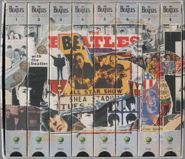
Ward also had to take into account all the different ways these images would or could be used. “It was extremely challenging to lay out due to the varying proportions of the different design formats like cassettes, 45s, 12″ LP covers, LaserDiscs, VHS covers, etc., and so on. I developed a grid matrix which we constantly laid over the rough visual to keep checking that it would fit every format, and that each of the four Beatles were equally represented.” The genius of this is well illustrated by how the individual spines of the VHS tapes present when on the shelf:
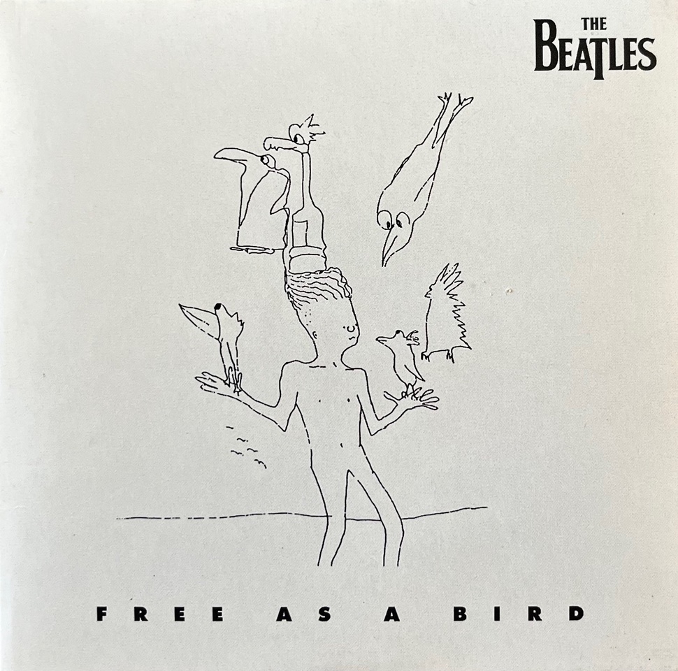
Ward was also involved in many of the Anthology spin-offs, like press kits and the quite substantial promo CD samplers for each Anthology album, not to mention the singles that came out for ‘Free As A Bird’ and ‘Real Love’. Each carried over elements of the original concept:
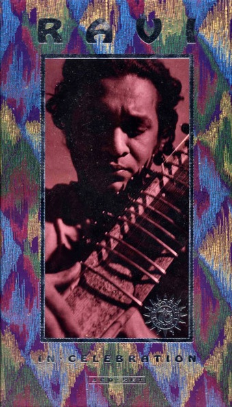
As is the way with these things, one thing lead to another. In 1996 Ward was also commissioned to design the Ravi Shankar retrospective compilation called In Celebration, a 4 CD box set co-produced by George Harrison:
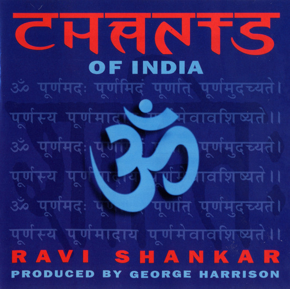
This was followed the next year by Ravi Shankar’sChants of India, also produced by Harrison:
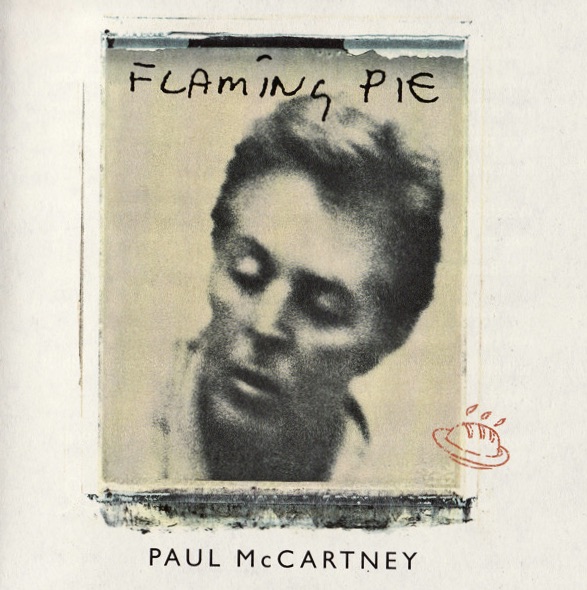
Interestingly, in 1997 Ward’s company The Team also designed the cover art and packaging for Paul McCartney’sFlaming Pie:
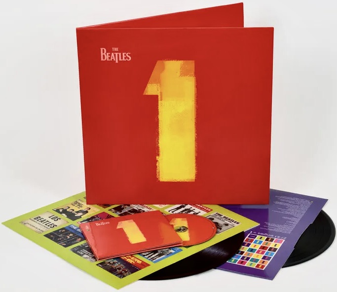
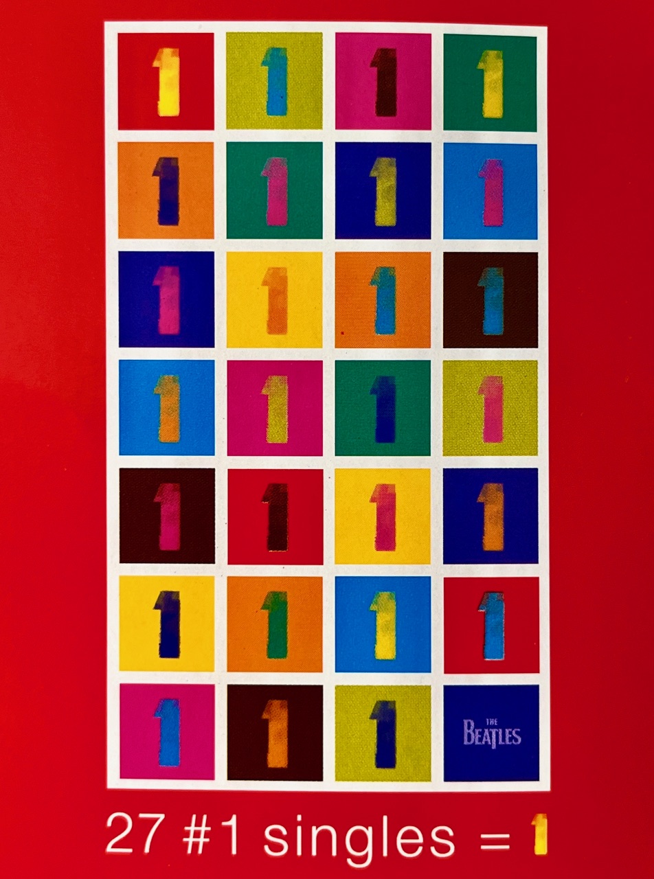
And then, in 2000, came another big one, probably the biggest – certainly from a sales perspective. Ward received a further commission from the Beatle camp to come up with ideas on how to present globally a new compilation of every Number 1 hit they’d had (all 27 of them) in an album simply to be called 1:
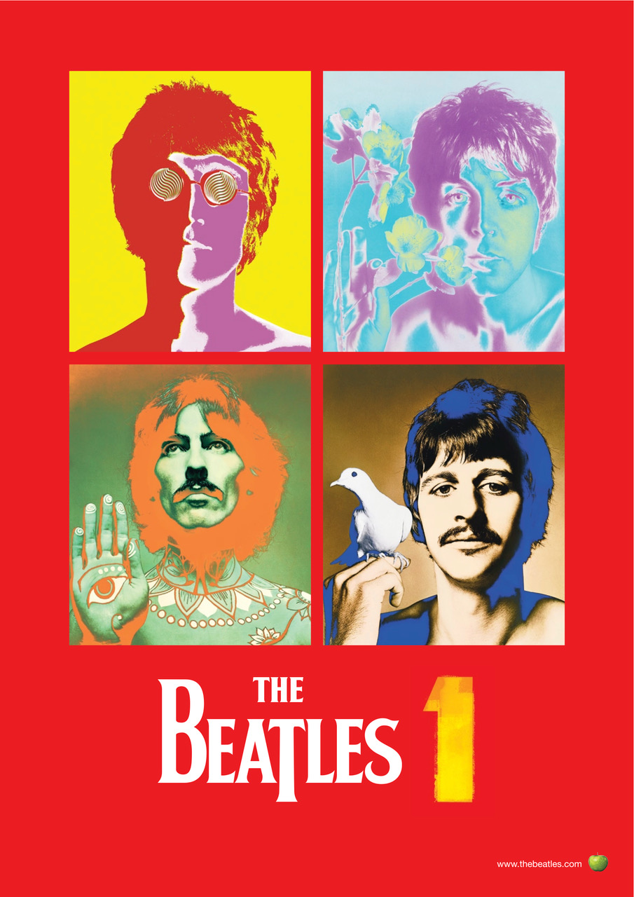
Speaking in PRINT Magazine in 2023 about the ideas he came up with Ward recalled: “I had always loved the graphic look of basic ticket printing for entry into dances in town halls, then we treated the bold “1” as a piece of graphic art, the “hero,” so to speak. So we kept it minimal, strong and simple. We obviously needed to have pictures of them somewhere in the album, and as the cover had turned quite pop art–ish, I was reminded of the ultimate iconoclastic photos Richard Avedon had taken of them in the ’60s for Look magazine, so I suggested using them.”
Inside the packaging was an absolute wealth of visual material for Beatle fanatics, including hundreds of picture sleeves from singles released around the world. There was also unique artwork and a common design theme which tied it all together as a musical and visual celebration of the band’s incredible success.
When asked which album design he was most happy with, Ward said, “I thoroughly enjoyed working on all of them, as they were each so different in what they were setting out to achieve and all had challenges to overcome. There is no one album that’s my favorite, and I learned so much doing each one. It was always interesting, stimulating and very challenging. Live at the BBC, being my first one, was initially quite overwhelming; being invited to design an album cover for the greatest band in the world was a bit unreal. But upon reflection, the fact that they were asking me meant that they had enough respect for me and my work, and so I was able to accept it, and take it as a compliment, and for the amazing opportunity it was.”
From time-to-time we like to bring you the background stories like highlighting some of the lesser-known players who helped The Beatles (either as a group or as solo artists) to extend their music through the art, design or photographs created for record covers, stage designs, tour programs and the like. You can find some more of those stories here:
As mentioned in December, we made some successful bids on a big Beatle and Beatle-related auction here in Sydney, Australia.
The other successful bid was on an auction lot made up of quite hard-to-find, original Australian (plus one quite rare New Zealand) Dark Horse Records singles. These are all 45’s you very rarely come across in the wild, so they’re welcome additions to the collection.
They each come in their original generic company outer sleeves too – in this case from Festival Records, which had the manufacturing and distribution rights for A&M Records (Dark Horse Records‘ parent company).
The first, which will be reasonably well-known to most, is from the George Harrison protégés Splinter. Their song ‘Costafine Town’ is lifted from the 1974 Dark Horse debut LP, The Place I Love. Harrison produced all the songs and played a variety of instruments, including electric and acoustic guitars, dobro, bass, and harmonium:
Next up another Splinter single, this time from 1975, called ‘Which Way Will I Get Home’ taken from the band’s second LP, Harder To Live produced by Tom Scott:
And there’s one other Splinter single from the Harder To Live LP, called ‘Half Way There’:
Also in this auction lot was a single from Shankar Family & Friends. It is of course ‘I Am Missing You’, taken from their self-titled 1974 LP, produced and arranged by George Harrison:
Jiva was a Los Angeles band signed to Dark Horse that released only one album with the label in 1975. From that self-titled album came this single. They had a nice funk/soft rock sound, but never made into the charts:
Attitudes was a bit of an L.A. super group consisting of killer keyboardist David Foster, brilliant guitarist Danny Kortchmar, bassist Paul Stallworth, and Jim Keltner on drums. They were all top flight session players who went onto play with just about everybody. In fact a very young David Foster met Jim Keltner while playing on George Harrison’sExtra Texture. Attitudes released two LPs on the Dark Horse label and this first single comes from their self-titled 1975 debut release:
This second single ‘Sweet Summer Music’ was included on Attitudes’ second album, from 1977, called Good News:
In this auction lot there was also an unusual New Zealand pressing of ‘Sweet Summer Music’ on the Dark Horse label but distributed there by WEA (i.e. Warner Bros. – hence the different company sleeve and small print on the labels). The label also contains a mistake as it incorrectly states under the title “from The Dark Horse Album “Attitudes” DH 3021″. It should say “from The Dark Horse Album “Good News” DH 3021″
If you want a bit more information on the Dark Horse label check out this article on the official George Harrison site.
When you see an iconic image like this one it is often fascinating to hear the backstory as to how it came about.
Photographer Chris Floyd has a fantastic tale to tell about working with Paul McCartney and the process of capturing an image of him for the ages:
If Floyd’s photographs looks familiar, that’s because another from that same shoot eventually made it’s way (some 12 years later via Paul’s own company MPL) onto the cover of Paul Du Noyer’s 2015 book, Conversations With McCartney:
As well as the YouTube above, Chris Floyd has written in detail about the session too, both in his book Not Just Pictures, and also at his substack.com page. His article there is well worth a read. It’s got some great additional information and images, plus two very surprising postscripts which add delightful new elements to the tale!
It’s been quite a while since we’ve seen a decent Beatle and Beatle-related auction held in our own hometown by a small auction house, but one happened about a week ago and it turned up quite a rare Paul McCartney/Fireman double LP from 1993, Strawberries Oceans Ships Forest.
We’ve had the CD version of this for a long time, but the vinyl has always been elusive. The problem is that you hardly ever see it for sale, and when it does come up it’s usually very pricey.
The standard edition is in a bright red/green cover with clear vinyl. But there’s an even rarer, limited edition in a white cover. And this is why we were very interested when a copy came up for grabs at a local auction place here in Sydney, Australia.
We made a single bid – and got it!
This rarer 2LP vinyl edition comes in a very plain white outer sleeve:
The album title wraps around the cover onto the rear, where there’s a limited edition number stamped in black in the centre (ours is No.263).
Apart from that, there’s no other info on the outside, except on the spine there is the catalogue number FIRE 1:
Inside there are two clear vinyl records. Both come in plain white, non-poly-lined paper sleeves:
And here are the labels in close-up. These too are different to the standard release:
So, this has been something of a grail find and Strawberries Oceans Ships Forest on vinyl can at last take its rightful place in the collection.
At the same auction we nabbed a selection of Dark Horse Records singles. These were Australian pressings from some of the more obscure bands that were signed to the label in the 1970s. More on that next time.