We’ve had readers doing a lot more detective work and research into the photographs that Klaus Voormann used for his collage and line drawings for the famous Revolver cover.
In case you’ve missed it the story on our blog started here and here when we stumbled across a terrific montage detailing all the then known images used for the cover.
Turns out the author of that montage was Ukrainian Beatle fan Sergey, one of our readers! He wrote to us letting us know he’d first created it (way back in 2012!) for a Russian Beatles discussion forum called beatles.ru.
Sergey has since tracked down the source of the image of Ringo used as inspiration for the line drawing of him Klaus placed at the bottom left of the Revolver cover – the one where he is looking skywards.
We’re still not sure of the photographer, but it was published in a German booklet Das sind die Beatles which features a series of black-and-white photographs and short comments about each. It was produced by Bravo magazine for the 1966 Bravo Blitztournee tour, under the auspices of Beat Publication Ltd. The photographer details are not indicated, but Sergey sent us these photographs of the actual publication:
We then published what we feel is another piece in the mystery – the photograph of John Lennon that was very likely the inspiration for Klaus’s line drawing of John at the top right-hand side of Revolver. You can read about that here.
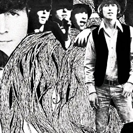
That prompted two other readers – Tom and burnham42 – to offer up even more clues. These revolve around the source images for the three small Beatle faces (and two hands) on this part of the cover:
burnham42 wrote:
I think the one of the three small photos top left is in The Beatles Anthology book page 70 (in my French edition). You can also find it on pinterest. The photo was taken on the way to Hamburg. There is John, Paul, George and Gerry and the Pacemakers in the photo. The man on the floor (George?) is pulling a face and you even have the hands that Klaus also used.
Well, drag out your English edition of The Beatles Anthology book too if you have one because the image is also on page 70 there as well:
The Anthology Book says the photo is from George Harrison’s private collection. The caption in the book reads: In a lay-by on the road to Hamburg and the Ost See. Me, Paul and John with Gerry and the Pacemakers.
We have George and Paul, who are standing on the left, and John sitting on the ground pulling a funny face.
Voormann has cut out three sections of this image. Paul has been placed to the left, his raised arm now just below George’s face. And he’s cropped John’s face to make it appear he has a Beatles hair-cut, and tilted it so that it is more upright. His hand from the image is also used, but also at a different angle.
So, one more mystery solved!
Following all this, Sergey has been back in touch and has offered up a revised, updated version of his original Revolver cover “sources” montage. Here it is:
Please click on the image to see a larger version.
This collage detailing the source photos for Klaus Voormann’s legendary cover image for the Beatles’ 1966 release Revolver has been doing the rounds for a while but its worth returning to because it is awesome:
(Click on the image to enlarge) Those pictures with yellow circles are still being sought after. If you know, contact us in the comments section below.
There’s a great article on the genesis of the cover here. “Revolver was the first Beatles’ album that truly marked out the four distinct personalities of the group. Voormann’s illustration captures the band perfectly. Looking at it, you can see that the group is made up of four unique individuals, but they are also connected by kinship, a friendship and an affinity for one another. It is the perfect summation of the band’s relationship at that point in time.”
UPDATE: Thank you to reader Angel who sent us a link to the Dutch magazine Furore and the information that they did a major article on the Revolver cover. It really looks good.
For those interested the exact magazine issue is Furore No 22, from January 2012. and it appears that back-issues are still available to be purchased.
They pitch it as “an exhaustive ten-page story describes the genesis of Klaus Voormann’s iconic cover design of The Beatles’ Revolver album, now fifty years ago, and traces the source of each photograph used therein.”
You can see a teaser graphic on Furore’s back-issues page for the larger article that’s inside the magazine. It gives a hint of the detailed info they provide on the origins of the photographs that Klaus Voormann used. Here’s that teaser image:
Click on image to see a larger version.
And here are two pages from the article itself:
Again, click on the image to see a larger version.
Also, on Revolver, we’ve just discovered the very good I Am The Eggpod podcast. You really should have a listen. Check out the latest episode where host Chris Shaw and songwriter and musician Andy Bell discuss the1966 masterpiece.
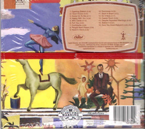
Now that the general public and the reviewers verdicts are in (all generally very positive btw), and now that Paul McCartney’sEgypt Station has entered the Billboard 200 at No.1, making it his first No.1 album on the US charts in over 36 years (the last time was Tug Of War in 1982), maybe it’s time to take a closer look at the cover art and design of the album – both in LP and CD form – because these too seem to have met with a very favourable reception from fans:
Explaining the album’s concept, Paul says, “I liked the words ‘Egypt Station.’… I think of it as a dream location that the music emanates from.” The title is taken from the piece of art which is featured on the album cover. It’s a limited edition lithograph, the original of which Paul himself painted back in 1988:
“My original inspiration [for the painting] was….Egyptian symbols and shapes I got from looking at a reference book on Egypt. I was interested in the way they drew sunflowers, so two appear on the left and on the right. It was a nice shape, so I took that and then I also love the way they symbolize trees. I like the way they reduce a tree to just some very simple symbols.” – Paul McCartney
The art directors hired for the project are Ferry Gouw, an illustrator, graphic designer and video director based in London, and Gary Card, a set designer, illustrator and artist also based in London. They’ve taken McCartney’s original painting and extended out its themes and style across many panels (for both the CD and the LP) in a spectacular way.
At first the two seem an odd choice as on the surface they both appear to work in very different worlds to that of Paul McCartney. Gouw inhabits more of an out there, conceptual electronic dance music, skater/cartoon world. He’s also the in-house designer for James Blake’s record label, 1800-Dinosaur. This video is a little old, but it gives a taste of Gouw’s style:
So, you might wonder how Gouw got the McCartney gig. Then you discover that earlier this year Roxy Music hired him to produce a new video interpretation of their legendary song (from 1972), ‘Virginia Plain‘. Gouw says:
“I wanted it to feel like a kaleidoscopic holiday in glamorous, but surreal locations, that only exist in vintage posters and your imagination. The song is so dense – the imagery comes thick and fast, so they all have to pop up in a stream of consciousness. So I researched vintage holiday posters, Americana pin-up icons, art deco jazz posters, and re-drew all the elements to make up the video.”
It was Bryan Ferry who commissioned the piece after being impressed with Gouw’s work on a video for his solo album, Olympia. The result has been described as the creative rebirth of an iconic track in British musical lore:
On the other hand, Gary Card seems more into groovy and colourful pop sculpture of late. By way of example there’s this amazing eight foot high plasticine Christmas tree he made for a London hotel last holiday season:Both Gouw and Card have been on Instagram since the release of Egypt Station: “After months of hard work this beauty is finally out in the world. So proud to see it everywhere, it’s a real privilege to be a part of this. Expect me and @garycard to be spamming Instagram with this for the next few years LoL” – Ferry Gouw
“Woke up this morning to news that the Paul McCartney album we designed is number 1 in the U.S 👍🏻 here’s the full art work @ferry_gouw n me based around @paulmccartney‘s original painting #egyptstation” – Gary Card. He then posted this image of the 6-panel “concertina” style packaging they devised for the CD:
When folded up the CD cover is held in place with a bright red cloth fabric elastic band:
For the exclusive Target and HMV editions (which have two bonus songs) the elastic band is green in colour to help set it apart:
It’s not the first time that McCartney has employed elastic bands to hold together a cover. In 1999, under his The Fireman persona, he released a 12″ vinyl featuring remixes of a song called ‘Fluid’, taken from the Rushes album. That folded cover has a red rubber band to keep everything in place too:
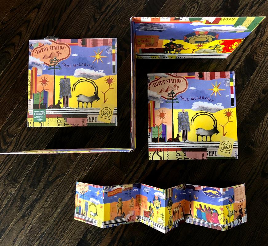
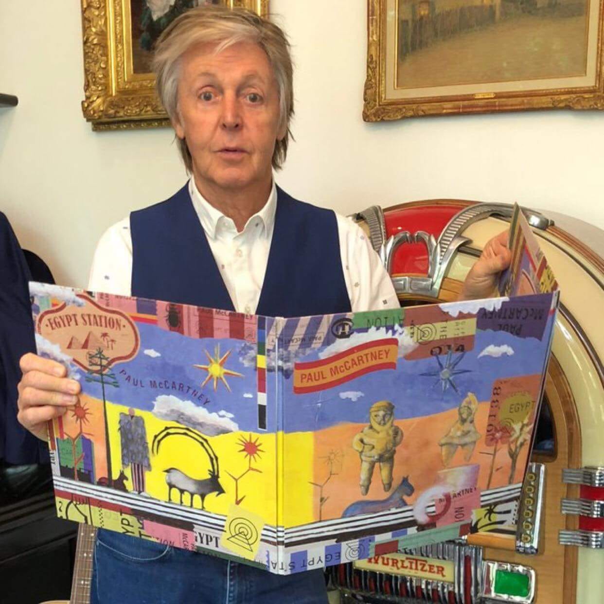
The Egypt Station “concertina” idea for the CD is also used for the vinyl record, but only in the “Deluxe Edition” design. This is a three-panel gatefold and you can see Sir Paul holding an example of it here:The LP cover is quite spectacular in this larger format, with a beautifully textured feel to the paper used giving a high quality tactile feel. There’s also a tri-fold lyric sheet in a deep blue which fits within – also beautifully designed by Gouw and Card. Here’s one page from the lyric sheet:
You can see how the LP package folds compared to the CD version a little more clearly here:
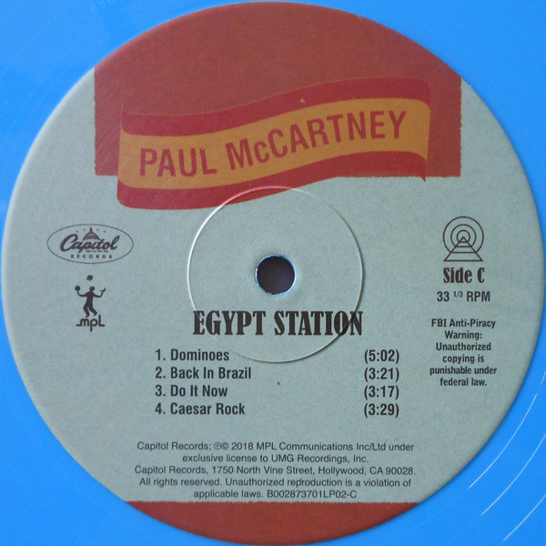
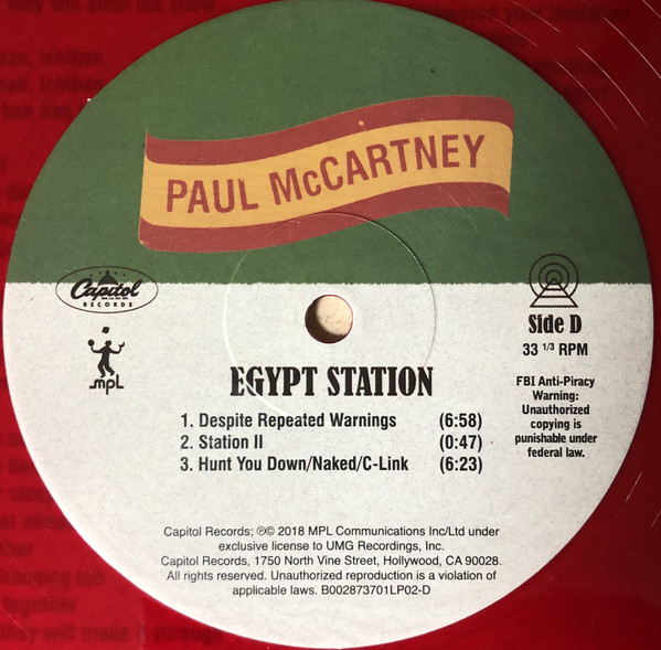
The attention to detail extends further inside, with the labels on each side of the LP being individually custom designed as well. Another nice touch:
And that brings us to the vinyl colours. Egypt Station is offered in black vinyl (140 gram standard, and 180 gram deluxe); in blue and orange coloured vinyls for the deluxe version – only available via McCartney’s official site; in red vinyl as a Barnes & Noble store exclusive; and in green vinyl – offered to Spotify subscribers first, but for a period also available to all via the McCartney site as well.
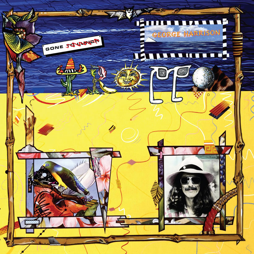
When the images for Egypt Stationfirst began to appear many likened the cover to George Harrison’s 1982 outing, Gone Troppo:
Yes, there are certain similarities in the colours and the pastiche style used, but Egypt Station‘s artwork goes far beyond. It harkens back to the days when albums really were works of art. They could be folded out and explored and enjoyed as an immersive experience in themselves, quite apart from the music contained within. We think Ferry Gouw and Gary Card should be congratulated.
Interesting peice of trivia: In 2004, when Paul headlined the Glastonbury Festival in England, the same Egypt Station artwork from his original painting adorned the pre-show curtain:
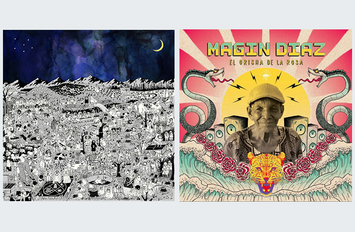
There is a Grammy Award for Best Recording Package of the year. In 2018 there was a tie for first place and so two winners were recognised (click here to see the list and scroll down to Award Number 65):
On the right is Magin Díaz’s El Orisha De La Rosa – Carlos Dussan, Juliana Jaramillo, Juan Martinez and Claudio Roncoli, art directors.
There’s a good article about both albums and their cover art here. There’s further information on both here also.
I guess we’ll just have to wait until January, 2019 to see if: a) Egypt Station receives a Grammy nomination for its extraordinary packaging, and b) it wins!
Paul McCartney always puts a lot of effort into the design and presentation of his albums. Two excellent examples are the totally integrated concept for his Electric Arguments release as The Fireman in 2008/09, which saw the standard CD right through to an extraordinary limited edition deluxe box set executed with aplomb; and his album New from 2013. You can find the story behind the cover art for that one here.
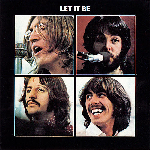
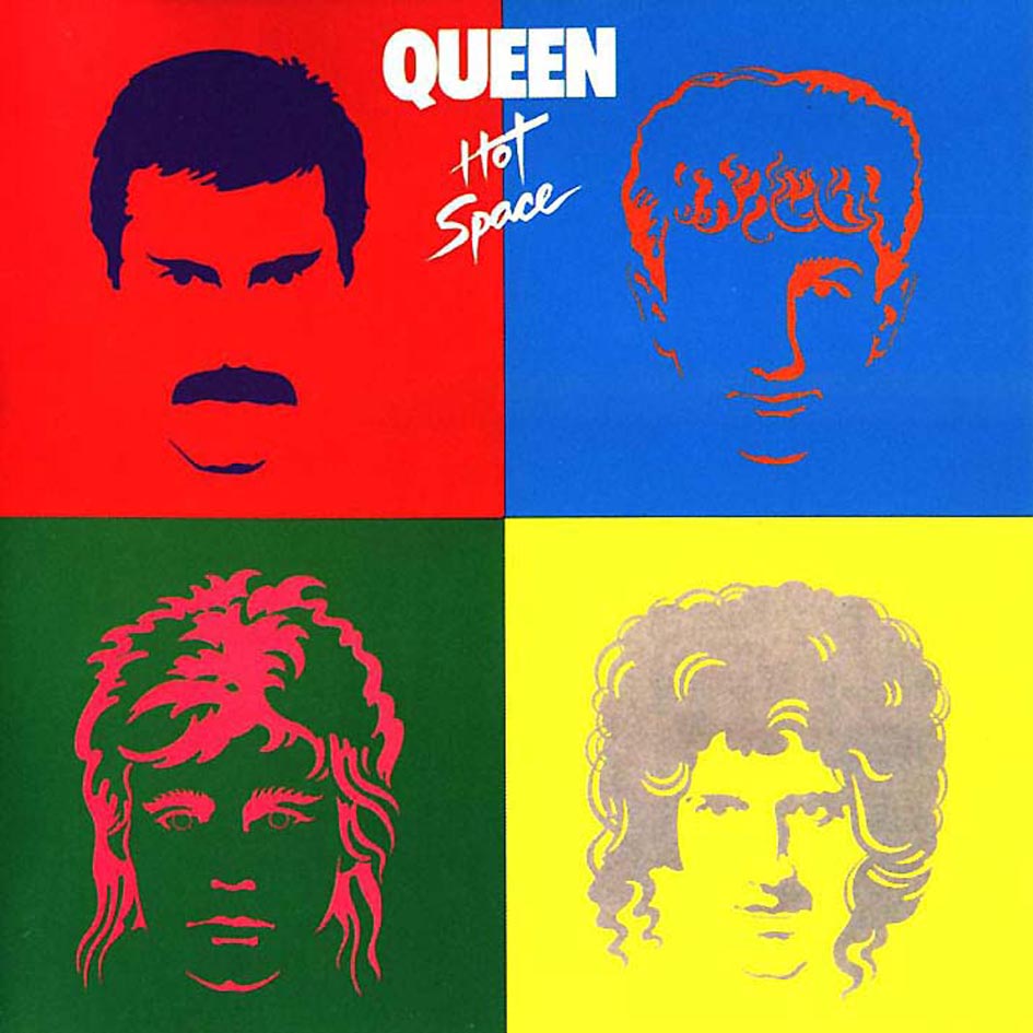
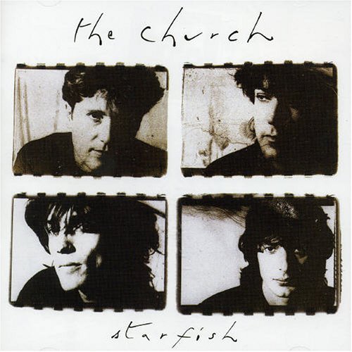
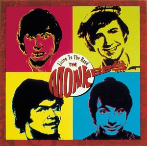
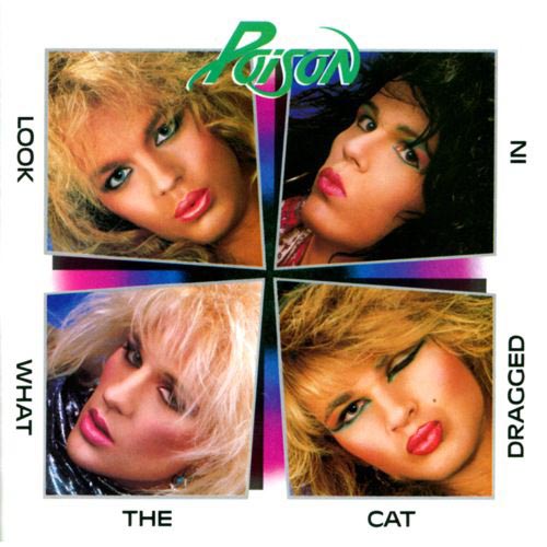
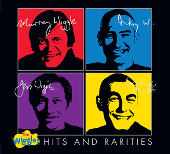
I was reminded of this post when I read the March, 2013 edition of Q Magazine recently. The mag ran an article called “Album Cover Clichés”. In it they featured a number of examples of what they labelled “the grid of four individual portraits”, writing that the most iconic example was Let It Be by the the Beatles. At the time it perfectly summed up the group’s together-but-apart dynamic:
Since then, as you can see below, there has been many an imitation:Even our world-famous Wiggles, the Australian children’s performers, have got in on the act:
Got any other examples that copy the artwork of the Let it Be cover? Let us know.


 Both Gouw and Card have been on Instagram since the release of Egypt Station: “After months of hard work this beauty is finally out in the world. So proud to see it everywhere, it’s a real privilege to be a part of this. Expect me and


 The LP cover is quite spectacular in this larger format, with a beautifully textured feel to the paper used giving a high quality tactile feel. There’s also a tri-fold lyric sheet in a deep blue which fits within – also beautifully designed by Gouw and Card. Here’s one page from the lyric sheet:
 You can see how the LP package folds compared to the CD version a little more clearly here: