Long-time McCartney Collaborator and Friend Dies

You might know if you’re a regular reader that we’re quite interested in celebrating artists and creatives who sometimes go unsung, but have helped The Beatles as a band or solo to achieve their artistic vision.

One such talented and long-time collaborator passed away last week.

His name was Sir Brian Clarke, a British painter, architectural artist, designer and printmaker, best known for his large-scale stained glass, tapestry, ceramics and mosaic projects. He was also known for his symbolist paintings and stage designs.

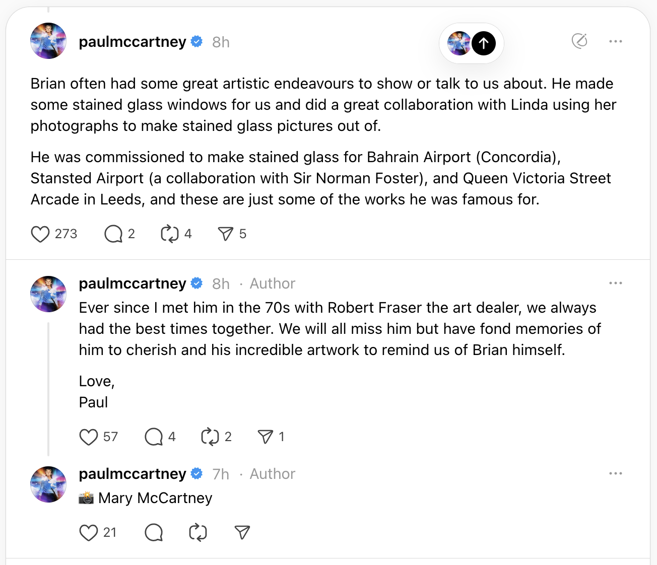
His artistic collaborations have included work with David Bailey, Hugh Hudson, Malcolm McLaren, and also with Linda and Paul McCartney. In fact, he was a firm friend of theirs and Paul has paid tribute to him this week in his socials:

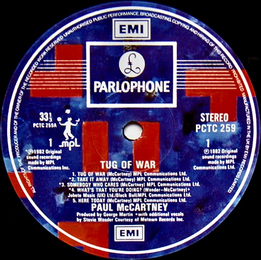
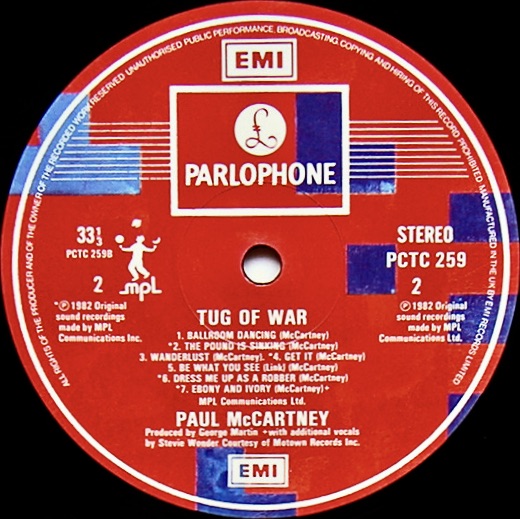
Brian Clarke’s first public collaboration with McCartney was his striking cover and label art for Paul’s 1982 album, Tug of War.

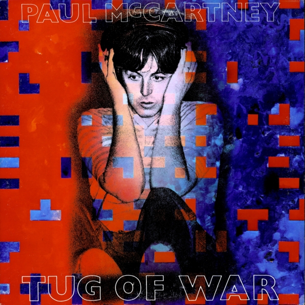
Clarke designed the cover, producing an abstract painting in oil on canvas that incorporated a painted portrait into the cover from a photograph by Linda McCartney of Paul in the recording studio. The geometric elements of the painting, which he calls ‘reticules’, were used in promotional material for the release, incorporated throughout the vinyl and CD booklets by Hipgnosis, and also appeared on the vinyl labels:

Clarke also designed and fabricated a series of Tug of War stained glass panels in different colours and treatments:

Each artwork is made of mouth-blown glass and these stained glass panels make a cameo appearance in the music video for the single from the album, ‘Take It Away’. You can see them briefly from about 3’10 in, during the scene set in the bar:

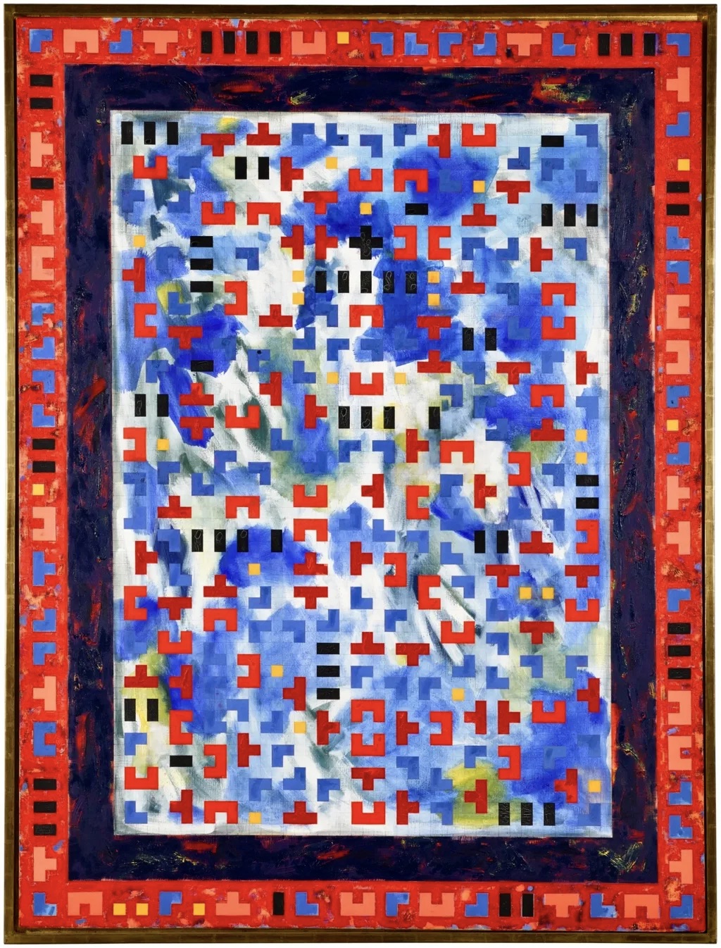
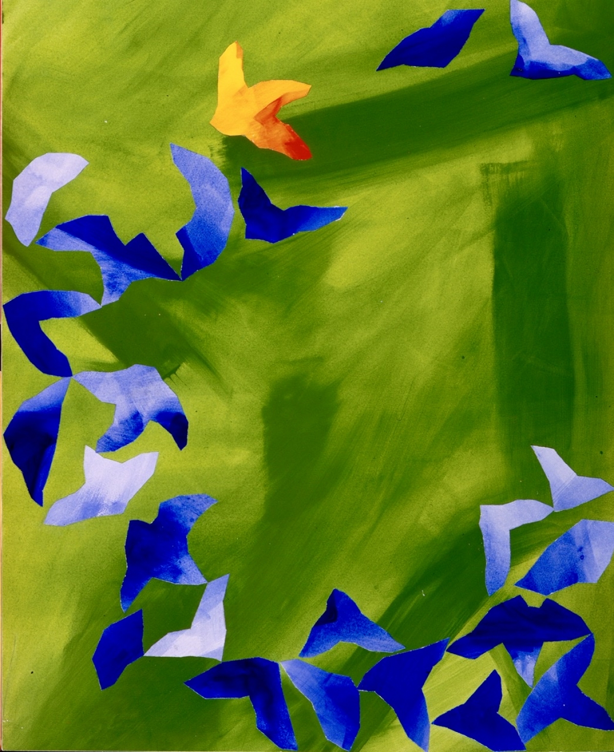
Interestingly, the style Clarke used for Tug of War is also evident in his paintings from the time as well, for example this one from 1982 – a series called The Rome Paintings:

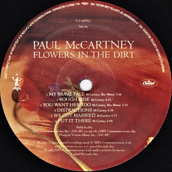
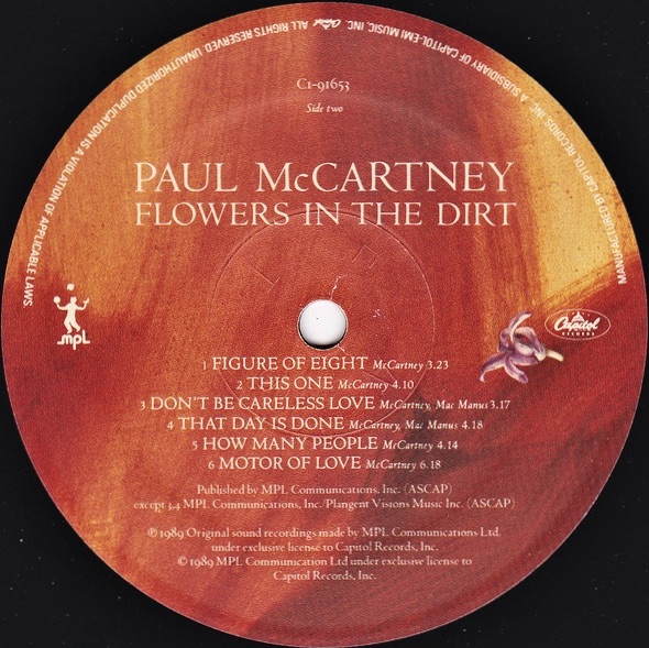
Clarke collaborated again with the McCartney’s in 1989 when he contributed to the cover artwork of the album Flowers In The Dirt:

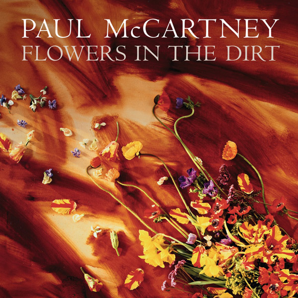
His concept again paired Clarke’s paintings and compositions (this time of of cut flowers) with Linda McCartney’s photography, producing a collaborative series of canvases and pictures. The photographs were shown at Linda’s Flowers in the Dirt exhibition at the Mayor Gallery, London, in 1989.

“I got the idea for the Flowers in the Dirt cover when I was staying at the Oriental Hotel in Bangkok. I did a sketch and a faxed it back to Paul. He said he was interested and wanted to see it developed. By then I was in New Delhi and I did the painting there. I flew back with it one Thursday night and Linda and I went into the studio the following day, laid the flowers on the canvas – which was still wet – and worked on it until we got it right.”

His art also adorned the press materials released to promote the album:

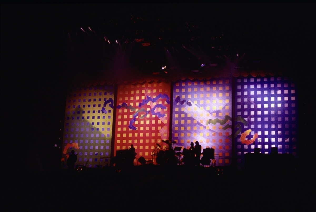
Brian also designed the stage sets for the The Paul McCartney World Tour, which accompanied the Flowers in the Dirt release:

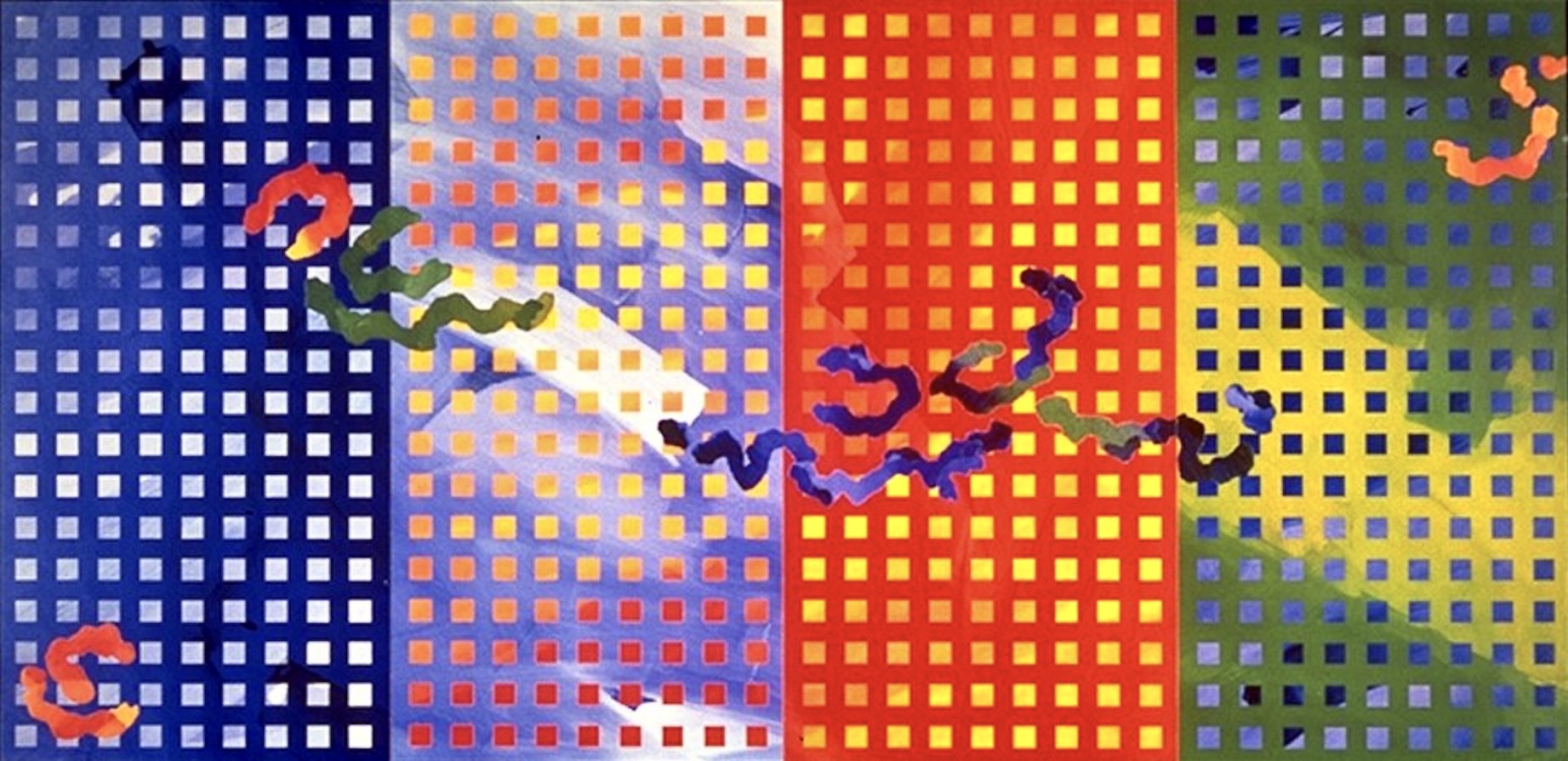
These were huge works that hung behind the band on stage:

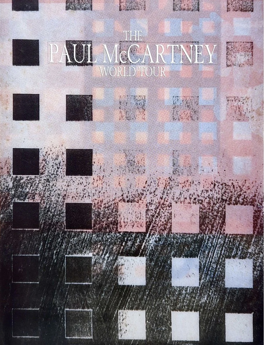
Clarke’s stage designs were also incorporated into The Paul McCartney World Tour posters and souvenir concert tour programs:

His other record cover art from this time includes the design for the cover of the single ‘Figure of Eight’, taken from the Flowers in the Dirt LP:

Brian Clarke also created stage designs for The New World Tour in 1993. His painted stage sets and projections included collaged biographical pictures by Linda McCartney, a photographic history of stained glass, and appeared on promotional materials designed for the tour. Those hand-painted sets, on canvas and on acoustically transparent scrims, became the world’s largest-ever stage sets, and are Clarke’s largest ever paintings:

“The main sets were painted, and the projections included a collage I made of photographs of my favourite works in stained glass from the 11th century to the present day, used by Paul as the backdrop to ‘Let It Be’. Somehow the imagery and the rolling depth of colour across the enormous stage morphed perfectly with the religious mood that is always provoked when one listens to that remarkable song.”

Then in 1997, not long before Linda’s death, she and Clarke held a joint exhibition called Collaborations. It showed works by both artists and collaborative pieces in which Linda’s photos were silk screened onto mouth-blown glass using a process of their own devising.

Linda McCartney, working with her friend, the artist Brian Clarke, is helping to spearhead a revival of an art form that has been dormant for more than 100 years – stained-glass photography. They have been secretly working for three years on reviving the technique, which was last in vogue in the 1880s, and which Clarke has experimented with once before. They have now produced a number of stained glass photographs, including a set of portraits of Sir Paul McCartney as well as other celebrities, friends, flowers and urban landscapes.” (The Independent, February 1998)

As a mark of the long friendship and artistic association he had with the McCartney family Brian was amongst a select few to deliver a message during Linda’s memorial service on June 8, 1998.

Then, in 1999, Paul McCartney released Working Classical, an album of his orchestral and chamber music. On it was a composition called ‘A Leaf’. In the CD booklet the notes about each work is accompanied by a creative image. For ‘A Leaf’ it was a photo of one of Linda and Brian’s stained glass works……

Jump forward another six years to the 2005 McCartney album, Chaos and Creation In The Backyard. The front cover image is a photo taken by Paul’s brother Mike McCartney. But inside the CD booklet, and in the vinyl edition, there are featured numerous line drawings by Brian Clarke:

The Special Edition CD came with a bonus DVD with a few extras, including an 11’30 animated film called Line Art featuring Brian’s drawings accompanied by instrumental tracks of the songs ‘Riding to Vanity Fair’, ‘At the Mercy’ and ‘Anyway’. The single that was taken from the album ‘Fine Line’ also featured Clarke’s work on the front cover:

Vale Brian Clarke, 2 July,1953 – 1 July, 2025.

His work in stained glass, painting and sculpture has been shown widely internationally, and can also be found in the permanent collections of the Victoria & Albert Museum and the Tate Gallery in London.

He was awarded a Knighthood in January 2024, becoming the first stained glass artist to be honoured for a medium that has significantly shaped the course of British art.

Covers for Forthcoming Wings Book Revealed

For some reason publishers in the US seem to want to be different to the rest of the world.

Take the recently announced book from the McCartney camp, Wings: The Story of a Band on the Run.

Initially there was no cover art ready for the official announcement, but now not one but two different covers have (ahem) broken cover.

This one is for the UK and the rest of the world:

And this one – the United States:

Who knows why the US needs a different look? There are two different publishers, so that could have something to do with it. In the US it will be Liveright/W W Norton, and for the UK & ROW it’ll be Allen Lane/Penguin.

The UK cover is a black and white version of this 1972 Linda McCartney colour image, taken during the Wings Over Europe tour:

The blue US cover is by artist Alex Trochut. He says “I’m a digital crafter. Wherever and with whomever I’m working, I let the needs of a project dictate its style. I try not to think my way into a design, quality is always my priority but I believe you have to let play drive you. My motto? Easy is boring. If you aren’t having fun pushing yourself, you aren’t doing it right.”

Trochut was born in Barcelona, Spain and after completing his art studies he established his own design studio in there before relocating to New York City. Through his design, illustration and typographic practice he has developed an intuitive way of working that has resulted in an expressive visual style. Alex has created design, illustration and typography for a diverse range of clients including Nike, Adidas, The Rolling Stones, Katy Perry, BBC, Coca-Cola, Pepsi, The Guardian, The New York Times, Time Magazine, and now he can add Paul McCartney and Wings to his resume!

So, which cover do you like best?

WIngs: The Story of a Band on the Run is out 4 November, 2025. Pre order your copy here.

Artist’s Poster the Unsung Star of the McCartney Bowery Gigs

Last week, as part of his warm-up for the Saturday Night Live 50th Anniversary Show, Paul McCartney played three small gigs (across three nights) at the relatively humble Bowery Ballroom in New York. It has a capacity of just 575 people, and tickets (at US$50.00 each) sold out immediately they went on sale – only if you showed up in person at the Bowery Ballroom’s box office.

The online announcements for each show were simple. Here’s the first:

🗽 PAUL McCARTNEY ROCKS THE BOWERY 🗽
Tuesday, February 11th. Bowery Ballroom, New York.

5:00pm Doors
6:30pm Showtime

Tickets on sale now only at Bowery Ballroom box office. No tickets sold online.
First come, first served. One ticket per person.

These intimate shows quickly became an event in themselves, taking even a place like New York City by storm:

After the concerts, reviewers swooned too. Variety was effusive:

Paul McCartney Electrifies New York’s 575-Capacity Bowery Ballroom With Career-Spanning Surprise Set

Even the tragically hip and usually cynical, hard-to-please Pitchfork Magazine was besotted:

Paul McCartney’s Magical Mystery Bowery Ballroom Show

Understandable really because who wouldn’t want to be at an intimate venue to see and hear Paul McCartney and his band play, up close and personal?

Anyways, apart from all the above, one thing that really resonated with fans on social media and in the forums was the amazing poster that was produced to help promote the event.

Lots of comments began to appear, praising the artwork and asking if it was for sale. Also, who was the artist who’d created it?

This poster was resonating with people because it encapsulates so well a journey in three distinct phases – starting with a young Paul McCartney in the middle and blossoming out to a recognisable profile image of the legend and man we see before us today.

But then again, it also radiates inwards as well: from the clouds and the universe on the outside profile, into the New York skyline and the Big Apple at the centre. How brilliant.

Well, it turns out the artist is an Argentinian named Santi Pozzi.

Pozzi is a graphic designer, art director, illustrator and screen printer from Buenos Aires. He graduated in Graphic Design at the University of Buenos Aires, and learned screen printing technique at The Firehouse Kustom Rockart Co. in Oakland, California. He later introduced gig poster art to Argentina and South America by putting together his own screen printing studio, Imprenta Chimango. He’s designed and printed official posters for Pearl Jam, Tame Impala, Jack White, Queens of the Stoneage, Primus and many others.

Check out Pozzi’s Instagram feed for more examples of his work.

From this fan photo of the merch stand at the Bowery Ballroom last week, it looks like the poster and a tote bag bearing Pozzi’s design were briefly available for sale:

But, will the poster be more widely available?

Yes it will.

While it’s not presently for sale via the official McCartney store websites, you can get Pozzi’s poster in artist proof quality from a company called Collectionzz, which specialises in official concert posters.

And just to cap it off, here’s a cool animated version of the poster that Collectionzz has produced for Instagram.

Egypt Station – The Packaging

Now that the general public and the reviewers verdicts are in (all generally very positive btw), and now that Paul McCartney’s Egypt Station has entered the Billboard 200 at No.1, making it his first No.1 album on the US charts in over 36 years (the last time was Tug Of War in 1982), maybe it’s time to take a closer look at the cover art and design of the album – both in LP and CD form – because these too seem to have met with a very favourable reception from fans:

Explaining the album’s concept, Paul says, “I liked the words ‘Egypt Station.’… I think of it as a dream location that the music emanates from.” The title is taken from the piece of art which is featured on the album cover. It’s a limited edition lithograph, the original of which Paul himself painted back in 1988:

“My original inspiration [for the painting] was….Egyptian symbols and shapes I got from looking at a reference book on Egypt. I was interested in the way they drew sunflowers, so two appear on the left and on the right. It was a nice shape, so I took that and then I also love the way they symbolize trees. I like the way they reduce a tree to just some very simple symbols.”  Paul McCartney

The art directors hired for the project are Ferry Gouw, an illustrator, graphic designer and video director based in London, and Gary Card, a set designer, illustrator and artist also based in London. They’ve taken McCartney’s original painting and extended out its themes and style across many panels (for both the CD and the LP) in a spectacular way.

At first the two seem an odd choice as on the surface they both appear to work in very different worlds to that of Paul McCartney. Gouw inhabits more of an out there, conceptual electronic dance music, skater/cartoon world. He’s also the in-house designer for James Blake’s record label, 1800-Dinosaur. This video is a little old, but it gives a taste of Gouw’s style:

So, you might wonder how Gouw got the McCartney gig. Then you discover that earlier this year Roxy Music hired him to produce a new video interpretation of their legendary song (from 1972), ‘Virginia Plain‘. Gouw says:

“I wanted it to feel like a kaleidoscopic holiday in glamorous, but surreal locations, that only exist in vintage posters and your imagination. The song is so dense – the imagery comes thick and fast, so they all have to pop up in a stream of consciousness. So I researched vintage holiday posters, Americana pin-up icons, art deco jazz posters, and re-drew all the elements to make up the video.”

It was Bryan Ferry who commissioned the piece after being impressed with Gouw’s work on a video for his solo album, Olympia. The result has been described as the creative rebirth of an iconic track in British musical lore:

On the other hand, Gary Card seems more into groovy and colourful pop sculpture of late. By way of example there’s this amazing eight foot high plasticine Christmas tree he made for a London hotel last holiday season:Both Gouw and Card have been on Instagram since the release of Egypt Station“After months of hard work this beauty is finally out in the world. So proud to see it everywhere, it’s a real privilege to be a part of this. Expect me and @garycard to be spamming Instagram with this for the next few years LoL” – Ferry Gouw

Woke up this morning to news that the Paul McCartney album we designed is number 1 in the U.S 👍🏻 here’s the full art work @ferry_gouw n me based around @paulmccartney‘s original painting #egyptstation” – Gary Card. He then posted this image of the  6-panel “concertina” style packaging they devised for the CD:

When folded up the CD cover is held in place with a bright red cloth fabric elastic band:

For the exclusive Target and HMV editions (which have two bonus songs) the elastic band is green in colour to help set it apart:

It’s not the first time that McCartney has employed elastic bands to hold together a cover. In 1999, under his The Fireman persona, he released a 12″ vinyl featuring remixes of a song called ‘Fluid’, taken from the Rushes album. That folded cover has a red rubber band to keep everything in place too:

The Egypt Station “concertina” idea for the CD is also used for the vinyl record, but only in the “Deluxe Edition” design. This is a three-panel gatefold and you can see Sir Paul holding an example of it here:
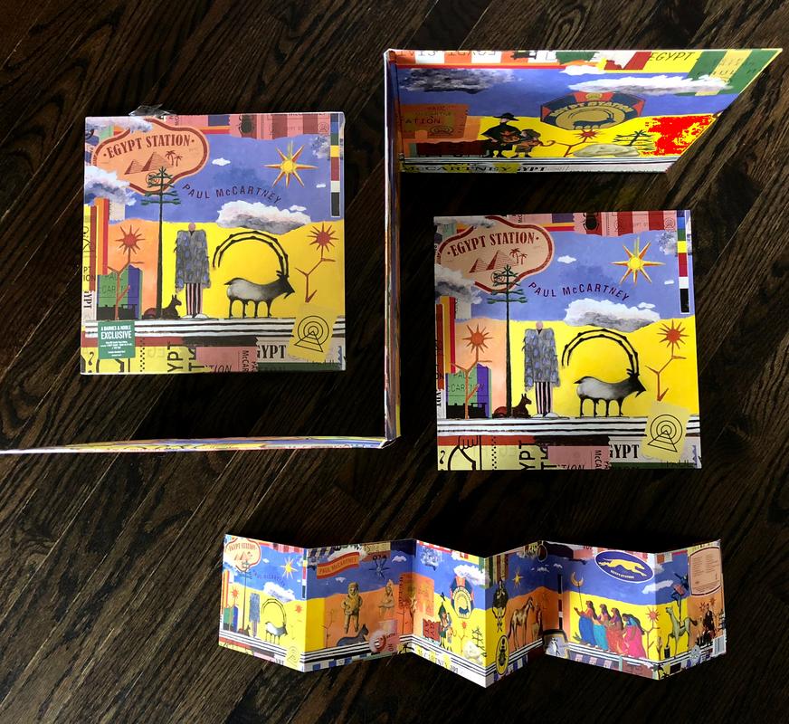
The LP cover is quite spectacular in this larger format, with a beautifully textured feel to the paper used giving a high quality tactile feel. There’s also a tri-fold lyric sheet in a deep blue which fits within – also beautifully designed by Gouw and Card. Here’s one page from the lyric sheet:

You can see how the LP package folds compared to the CD version a little more clearly here:

The attention to detail extends further inside, with the labels on each side of the LP being individually custom designed as well. Another nice touch:

And that brings us to the vinyl colours. Egypt Station is offered in black vinyl (140 gram standard, and 180 gram deluxe); in blue and orange coloured vinyls for the deluxe version – only available via McCartney’s official site; in red vinyl as a Barnes & Noble store exclusive; and in green vinyl – offered to Spotify subscribers first, but for a period also available to all via the McCartney site as well.

When the images for Egypt Station first began to appear many likened the cover to George Harrison’s 1982 outing, Gone Troppo:

Yes, there are certain similarities in the colours and the pastiche style used, but Egypt Station‘s artwork goes far beyond. It harkens back to the days when albums really were works of art. They could be folded out and explored and enjoyed as an immersive experience in themselves, quite apart from the music contained within. We think Ferry Gouw and Gary Card should be congratulated.

Interesting peice of trivia: In 2004, when Paul headlined the Glastonbury Festival in England, the same Egypt Station artwork from his original painting adorned the pre-show curtain:

There is a Grammy Award for Best Recording Package of the year. In 2018 there was a tie for first place and so two winners were recognised (click here to see the list and scroll down to Award Number 65):

Above on the left is Father John Misty’s Pure Comedy (Deluxe Edition) – Sasha Barr, Ed Steed and Josh Tillman, art directors.

On the right is Magin Díaz’s El Orisha De La Rosa – Carlos Dussan, Juliana Jaramillo, Juan Martinez and Claudio Roncoli, art directors.

There’s a good article about both albums and their cover art here. There’s further information on both here also.

I guess we’ll just have to wait until January, 2019 to see if: a) Egypt Station receives a Grammy nomination for its extraordinary packaging, and b) it wins!

Paul McCartney always puts a lot of effort into the design and presentation of his albums. Two excellent examples are the totally integrated concept for his Electric Arguments release as The Fireman in 2008/09, which saw the standard CD right through to an extraordinary limited edition deluxe box set executed with aplomb; and his album New from 2013. You can find the story behind the cover art for that one here.

FOR MORE ON EGYPT STATION SEE ALSO:

Record Store Day Double A Side to be released; a retro Egypt Station Cassette; some Egypt Station Reviews; the Spotify Egypt Station Green Vinyl; and Packaging Variations of Egypt Station.

Why Yoko Ono (Still) Matters

On the eve of a major new retrospective exhibition of her art, Vogue magazine has published an interesting article about the importance of Yoko Ono as an artist in the 1960’s.

Beginning today at the Museum of Modern Art in New York is an exhibition entitled “Yoko Ono: One Woman Show, 1960-1971″.Yoko_Ono_MOMA2Yoko_Ono_MOMA1

Of course any discussion about Ono inevitably comes around to her relationship with John Lennon and the Beatles. As Vogue says about this exhibition: “….even though John Lennon is visible and mentioned, it is gently done. On these gallery walls, we see him less as a Beatle and more as a fellow artist.”

And: “If you grew up with the Beatles, it can be difficult to like Yoko Ono. People like to accuse her of turning Lennon into a humorless hippie, the two of them tweaked out on too much acid, calling for peace. They like to point out that he stopped making music to be a dad, while Ono pursued her career as an artist. Lennon loved her—their chemistry is unmistakable—but this alone didn’t get his fans to love her, too. We like our idols unattached, even if they’re unavailable.”

See also Vogue’s article In Praise of Yoko Ono’s Inimitable Style

You’ll notice that the Illy coffee company is a sponsor of the MOMA exhibition. As part of that Yoko Ono has produced seven, limited edition espresso coffee cups as part of the company’s Art Collection series by famous artists. You can learn more about these hereYoko Ono illy Art Cup