Rick Ward – Beatles and Solo Album Designer

If I said the name Rick Ward to you, you’d probably reply, “Rick who??”

Which is interesting because if you’re a Beatle fan with even a half-decent collection you’ll definitely have at least five or six examples of his work amongst your vinyl, CDs and DVD’s.

We’re all aware that long-time Beatle mate, bass player and artist Klaus Voormann (along with fellow artist Alfons Kiefer) painted the fantastic cover art for the Anthology series, but did you know the entire Anthology concept and packaging brief was the brainchild of a guy called Rick Ward?

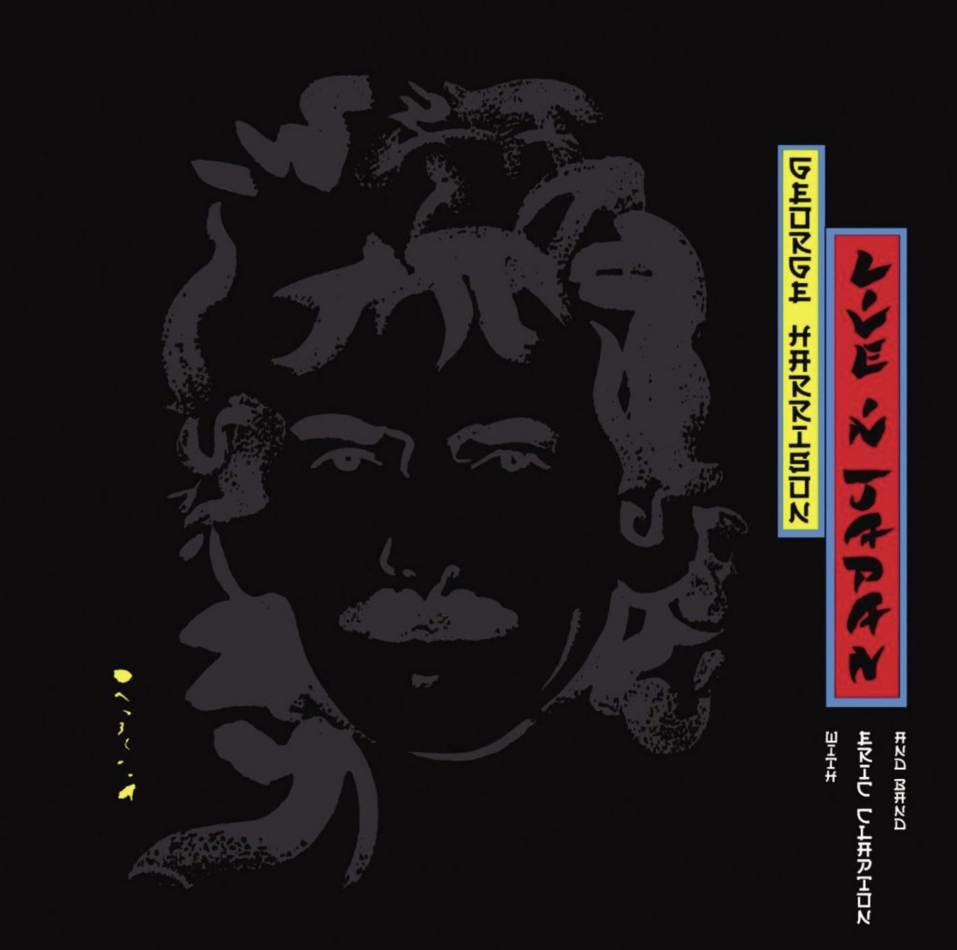
In 1995 Ward was working for The Team, a top London design and branding company. He’d already done some work for George Harrison, designing the sleeve and contents of his 1992 double LP, Live In Japan (now long out of print but soon to be re-issued on Dark Horse/BMG):

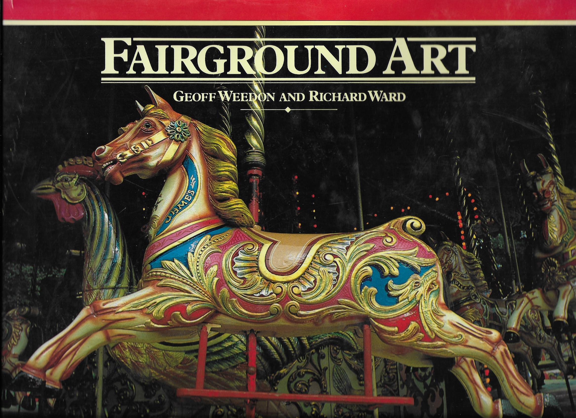
Ward had met George through a client of The Team, the F1 car designer Gordon Murray. They’d been working together on the graphics, marketing and launch of the McClaren F1 supercar. As we know, Harrison was a mad F1 racing fan and it turns out that he knew Murray who had given the Beatle a book for his birthday on the history of fairground art – co-authored by none other than Rick Ward:

George obviously loved that book because he called Ward and invited him to visit Friar Park. The two subsequently became friends and before you know it he was designing the Live in Japan package. A year later it was George who suggested Ward might come up with the design for The Beatles Live at the BBC packaging. He was soon invited into Apple to discuss and produce concepts for what would be the band’s first new album of previously unreleased material since Let It Be:

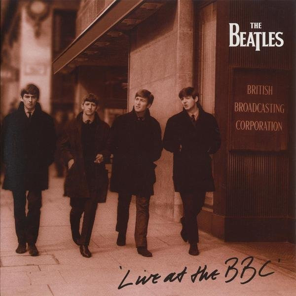
Ward recounts a funny story behind the hand-written title of the front cover: “The concept was a fan’s photograph with an autograph on the front. I had found a great image, got the picture retouched, and then just wrote “Live at the BBC” in the corner. It was supposed to mimic the bootleg albums that were cropping up at the time. They instantly loved it, but we had to decide whose handwriting was going to be on the front. I asked Paul, George, Ringo and Yoko to take a pen and write “Live at the BBC” just like they were signing a photograph. I then printed all the versions out, randomly adding mine and Neil Aspinal’s to the mix. I then sent the options back to the four of them and asked them to choose their favorites. When they came back with their votes, I couldn’t believe it: It was mine!”

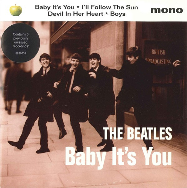
Ward also got involved in the cover for Baby It’s You, the four-song EP released in support of Live at the BBC which featured three additional previously unreleased songs:

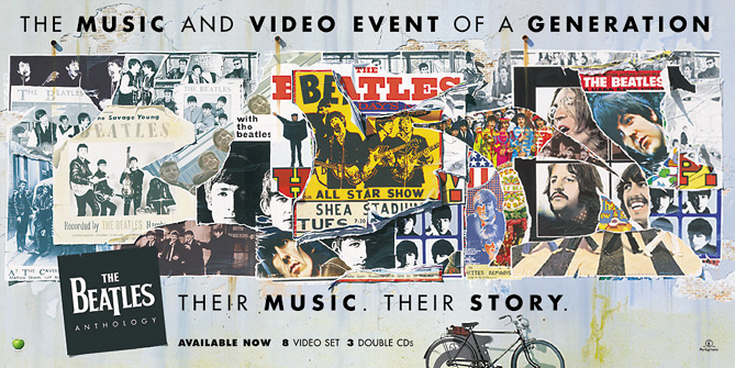
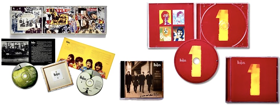
So, another success. It proved worthwhile because in 1995 The Beatles and EMI started on Anthology, the largest music project ever attempted by the band: three triple albums plus a multi-part TV documentary subsequently released on VHS tape (and DVD) as boxed sets. Not to mention a book, all covering their entire recording career, released across every major format of the time. Anthology was to be a definitive statement, the band telling their own story and setting the record straight. The concept for it all, conceived by Ward, was an artist’s painting, a ‘masterpiece’ and a rediscovery of ‘their art’.

Last year when talking about the design Ward recalled: “I had always considered their music and  lyrics as works of art, so that was my starting point. The idea was for the project to literally be a work of art that could be divided up into three sections that charted and reflected their career – giving equal presence to all four members…..To realise this, we invited six artists, each with their own creative connection to the band, to respond to the brief.”

Those artists were David Hockney, Peter Blake, Brian Grimwood, Humphrey Ocean, David Oxtoby and Klaus Voormann. Only five submitted their thoughts. Peter Blake (the artist behind the iconic Sgt Pepper‘s Lonely Hearts Club Band cover art) simply refused. He wasn’t going in a competition. They could either choose him outright, or not at all. Of the other five Ward recalls it was Voormann’s concept that immediately stood out. “It perfectly captured the album and importantly, it allowed us to work with pre-approved imagery, which was vital, because literally everything had to be unanimously approved by each individual Beatle before it could move forward.” Klaus later decided to take the idea further, transforming his collage into a painted work that retained its layered quality but added more depth.

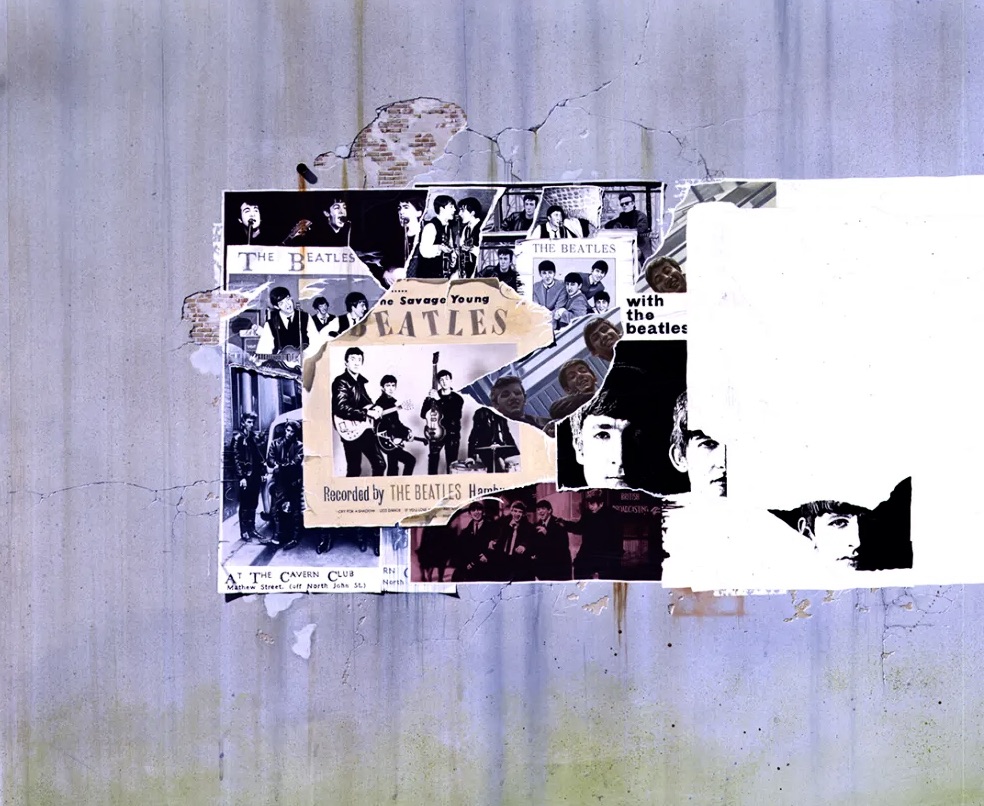
“Together, we developed the vision by using the idea of a large billboard poster on the side of a  fictitious concert hall they had played at from the beginning to the end of their recording career. It became both an artwork and a metaphor for their legacy.”

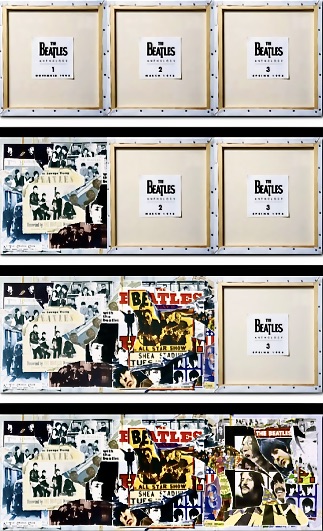
“A small but defining design touch came on the back covers. Since the concept revolved around a “work of art,” I chose to show the reverse of the canvas, as a teaser for the pre-release marketing. It gave the sense of seeing a masterpiece in progress, an artist’s work evolving before your eyes, while also serving as a teaser for what was to come. This gave Klaus much needed time, between each release date to then go on to do the second image, and then finally the third completed image.”

Very clever, but even so they worked right down to the strict deadline for each release to get the covers completed:

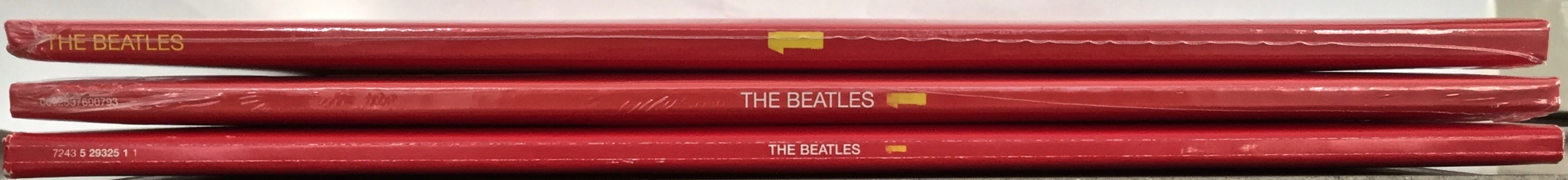
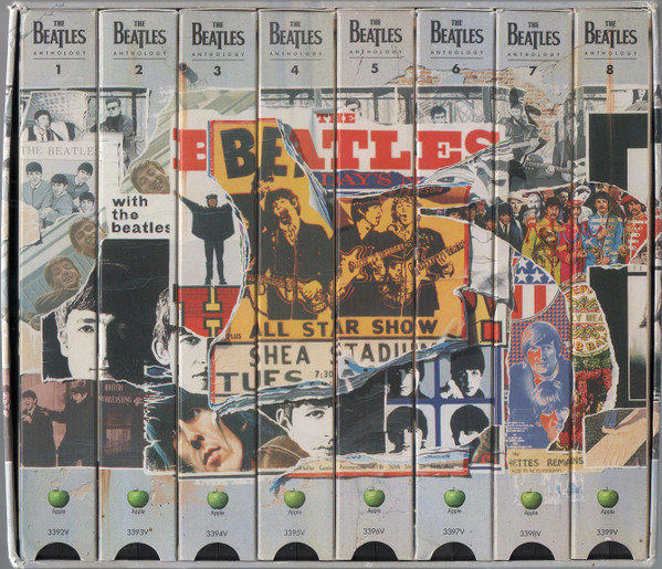
Ward also had to take into account all the different ways these images would or could be used. “It was extremely challenging to lay out due to the varying proportions of the different design formats like cassettes, 45s, 12″ LP covers, LaserDiscs, VHS covers, etc., and so on. I developed a grid matrix which we constantly laid over the rough visual to keep checking that it would fit every format, and that each of the four Beatles were equally represented.” The genius of this is well illustrated by how the individual spines of the VHS tapes present when on the shelf:

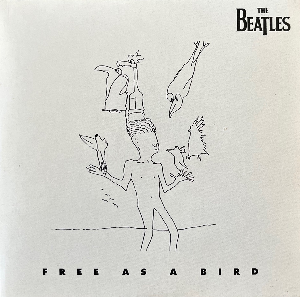
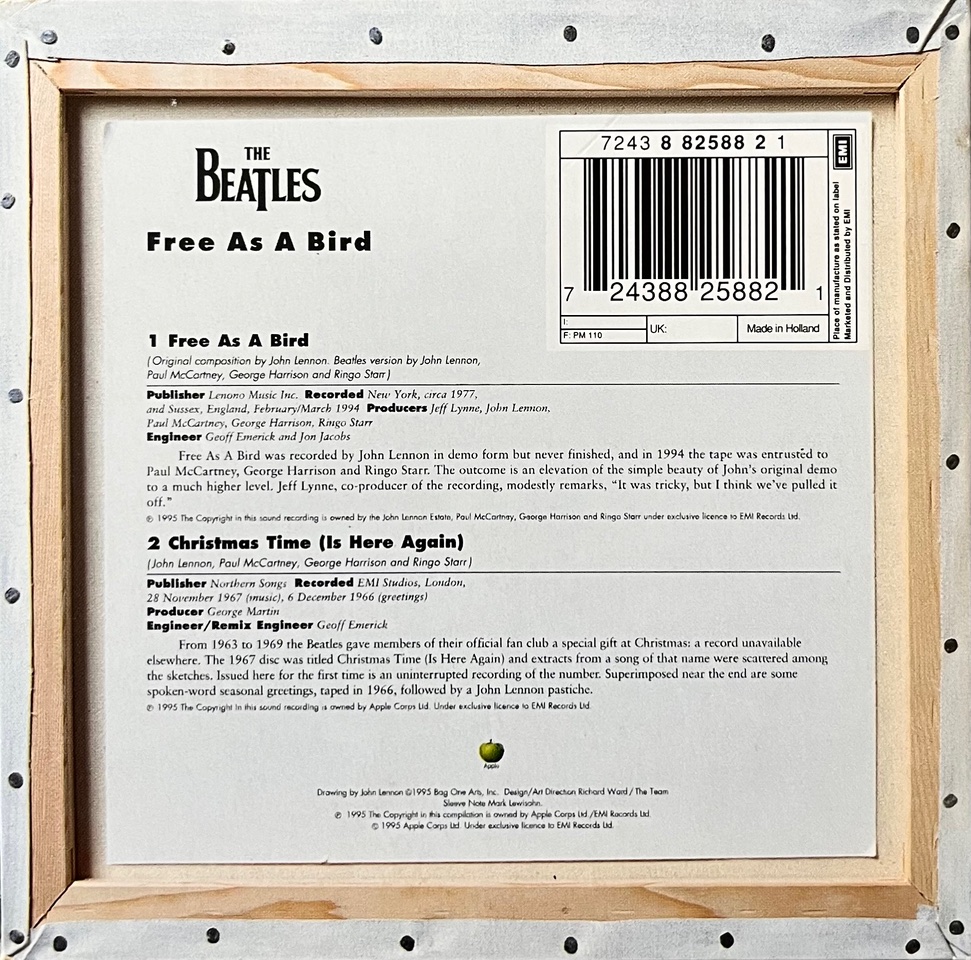
Ward was also involved in many of the Anthology spin-offs, like press kits and the quite substantial promo CD samplers for each Anthology album, not to mention the singles that came out for ‘Free As A Bird’ and ‘Real Love’. Each carried over elements of the original concept:

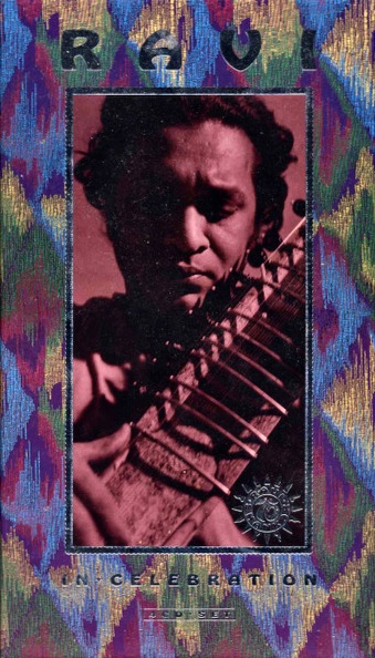
As is the way with these things, one thing lead to another. In 1996 Ward was also commissioned to design the Ravi Shankar retrospective compilation called In Celebration, a 4 CD box set co-produced by George Harrison:

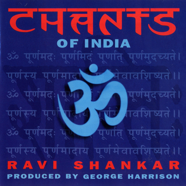
This was followed the next year by Ravi Shankar’s Chants of India, also produced by Harrison:

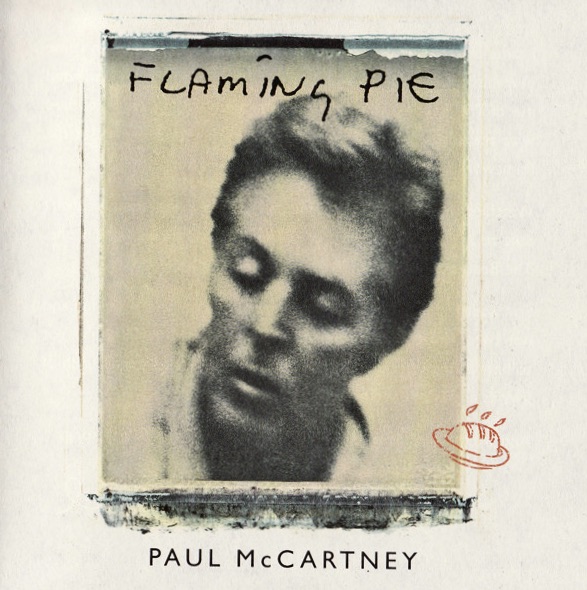
Interestingly, in 1997 Ward’s company The Team also designed the cover art and packaging for Paul McCartney’s Flaming Pie:

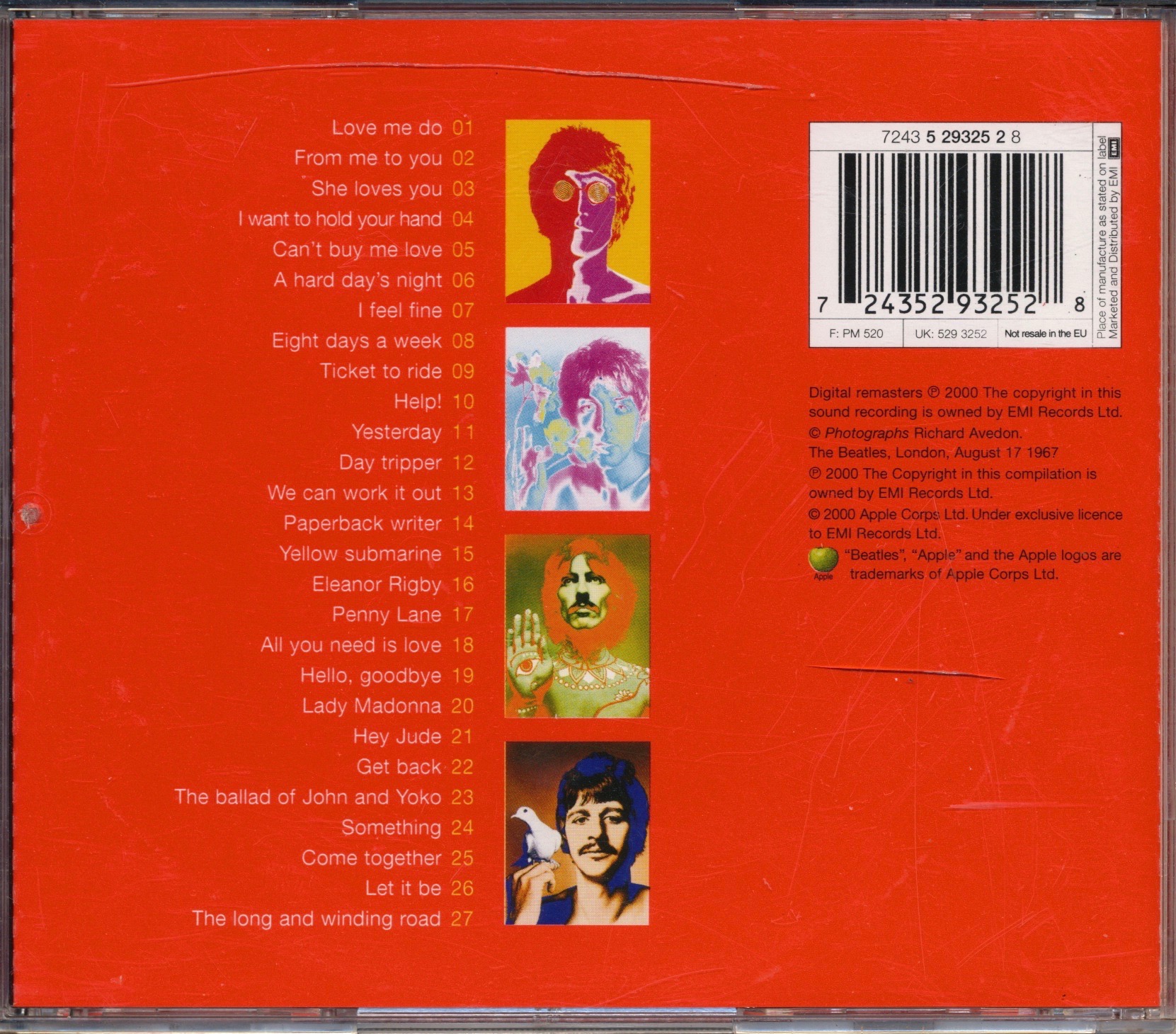
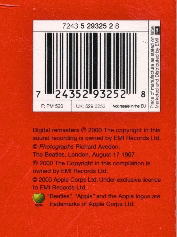
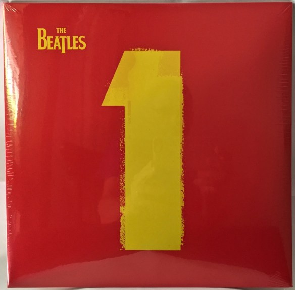
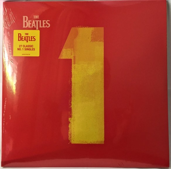
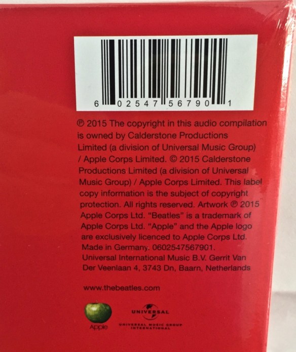
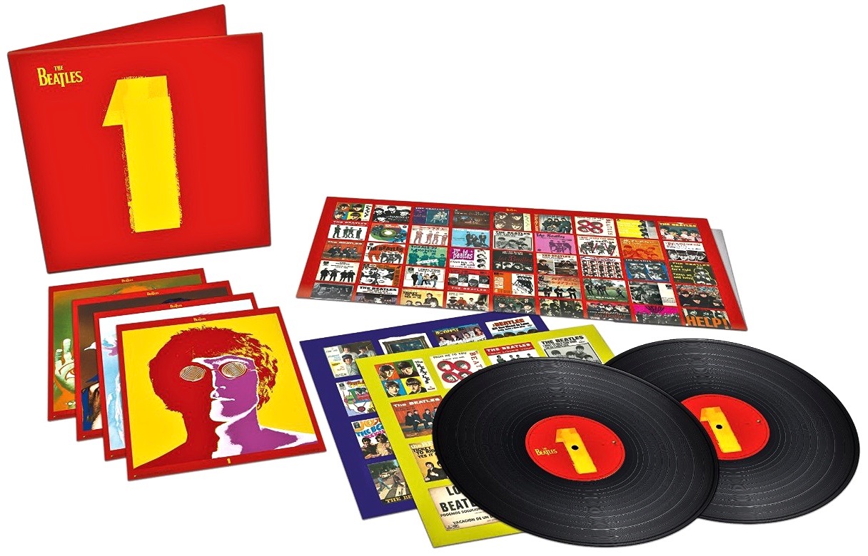
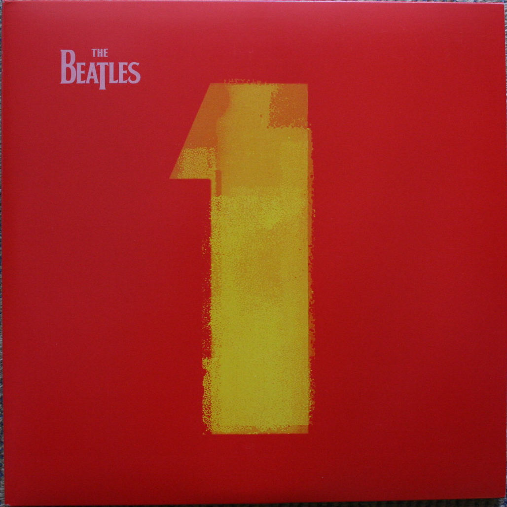
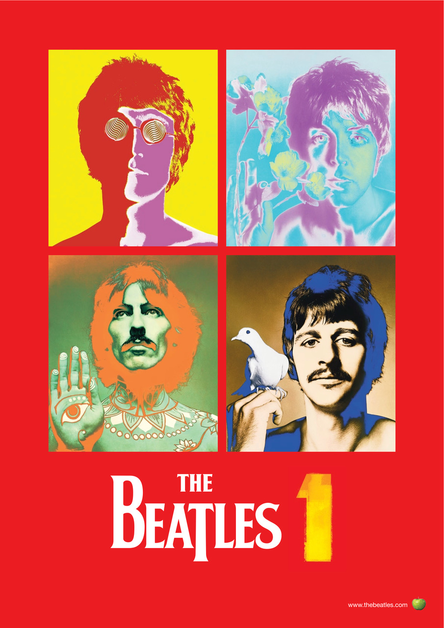
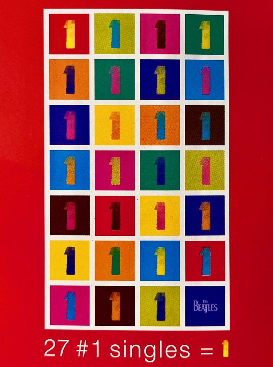
And then, in 2000, came another big one, probably the biggest – certainly from a sales perspective. Ward received a further commission from the Beatle camp to come up with ideas on how to present globally a new compilation of every Number 1 hit they’d had (all 27 of them) in an album simply to be called 1:

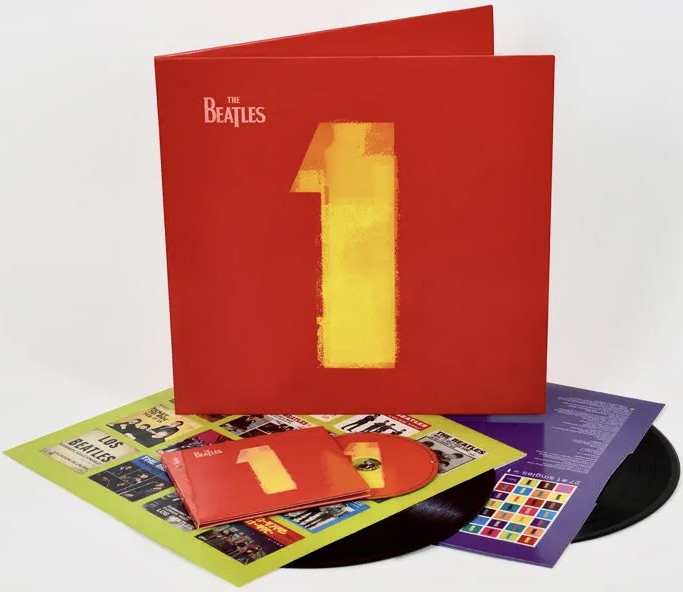
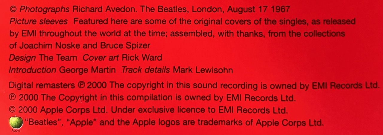
Speaking in PRINT Magazine in 2023 about the ideas he came up with Ward recalled: “I had always loved the graphic look of basic ticket printing for entry into dances in town halls, then we treated the bold “1” as a piece of graphic art, the “hero,” so to speak. So we kept it minimal, strong and simple. We obviously needed to have pictures of them somewhere in the album, and as the cover had turned quite pop art–ish, I was reminded of the ultimate iconoclastic photos Richard Avedon had taken of them in the ’60s for Look magazine, so I suggested using them.”

Inside the packaging was an absolute wealth of visual material for Beatle fanatics, including hundreds of picture sleeves from singles released around the world. There was also unique artwork and a common design theme which tied it all together as a musical and visual celebration of the band’s incredible success.

When asked which album design he was most happy with, Ward said, “I thoroughly enjoyed working on all of them, as they were each so different in what they were setting out to achieve and all had challenges to overcome. There is no one album that’s my favorite, and I learned so much doing each one. It was always interesting, stimulating and very challenging. Live at the BBC, being my first one, was initially quite overwhelming; being invited to design an album cover for the greatest band in the world was a bit unreal. But upon reflection, the fact that they were asking me meant that they had enough respect for me and my work, and so I was able to accept it, and take it as a compliment, and for the amazing opportunity it was.”

From time-to-time we like to bring you the background stories like highlighting some of the lesser-known players who helped The Beatles (either as a group or as solo artists) to extend their music through the art, design or photographs created for record covers, stage designs, tour programs and the like. You can find some more of those stories here:

Richard Hamilton

Ferry Gouw and Gary Card and also see here.

Brian Clark

Santi Pozzi

Chris Giffin

Kathryn Durst

Ed Ruscha

An Unusual Beatles “1” CD

We were at a record fair the other day and picked up The Beatles 1 compilation CD from 2000. The front cover looks familiar:Beatle 1 Not EU 1

As does the rear:Beatle 1 Not EU 2

That is, until you look more closely at the fine print – just below the barcode:

Beatle 1 Not EU 4

There it says quite clearly, in bolded letters, “Not resale in the EU“. Never seen that before. Then there’s the disc itself:Beatle 1 Not EU 3

Looks rather standard, but it too has the words “Not resale in the EU. LC 0299” in the small print around the perimeter:

Beatle 1 Not EU 3-1

Anyone seen this one before, or know what it means?

Beatles 1 – 2015 Vinyl

Look what arrived in the post today:Beatles 1 2015 1

Yes, it’s the 2015 edition of The Beatles 1 on double vinyl, complete with the Giles Martin remixes and remastering.

This one is staying sealed for now so we can’t show you the detail of what’s inside (for that go to this post to see in detail the 2000 edition). The contents themselves for all editions are very much the same. What we can show are some of the key external visual differences between the 2015 edition, directly alongside those from 2014 and the one from 2000.

Firstly that front cover. Two things really. The words “The Beatles” are in yellow on the 2015, while for both the 2014 and 2000 versions those words are sort of a light pink. Also on the 2015 edition the big figure “1” is more solidly coloured in and is a much brighter shade of yellow. Compare the front cover image of the 2015 edition above with 2014 (which is also still sealed and came with a sticker attached to the plastic):Beatles 1 2014 1

And here’s the older 2000 (which has been opened and hence is not as glossy as the others in the photos). The printing of these two is very similar:Beatles 1 2000 1

On the rear all covers are very similar. There is just a simple track-listing running down the centre. The part where they differ is at the top right-hand side where logos, barcodes, and the small print about who has the rights to what appears. Firstly 2015 (note the references to Calderstone Productions, the Universal Music Group, and Apple:Beatles 1 2015 2

Here’s the 2014 edition (again, Calderstone, Universal and Apple):Beatles 1 2014 2

And lastly the 2000 release (back when EMI held the reins):Beatles 1 2000 2

Finally the spines. Here they are stacked on top of each other. On top is the 2015 edition, then 2014, and on the bottom 2000: Beatles 1 spinesThere are quite a few variations. (Click on the image to see a larger version).

Beatles 1 Remastered and Remixed Double LP

Following on from all the excitement of the last week, next month will see the double vinyl LP edition of The Beatles 1 in 2015 form featuring the new stereo remixes created by Giles Martin:Beatles_1 2015 vinyl (1)

The 2015 version of The Beatles 1 CD was released last week, along with numerous Blu-ray/DVD video iterations. The gatefold, 2LP 180g vinyl set looks to be packaged exactly the same as the two previous releases of this title (in 2011, and again in remastered form only just last year). Like them, it will come with four art cards (11′ x 8.5′), two inner jackets packed with images of original single sleeves, and a huge poster (33′ x 22′) featuring examples of more single sleeves from around the world:Beatles_1poster-900x1351

Interestingly, all previous versions of The Beatles 1, featuring the 2009 remasters (first issued in 2011), are set to be quietly withdrawn and the new CD and vinyl versions with the new stereo remixes will permanently supersede them.

The Beatles 1 on 2LP vinyl will be released on 4 December 2015.

Fifth and Final Instalment of “Restoration of The Beatles 1 Video Collection” Released

The final instalment in the five-part series backgrounding the work done to restore the Beatles 1 video collection has been uploaded to YouTube:

In it leading Australian Director of Photography Mike Molloy reminisces about his time with the Beatles. In 1968 he’d been living and working in London as a freelance cameraman for about a year when he was asked to go down to EMI’s Studio Three at Abbey Road and film a promo clip for “Lady Madonna”. Instead, what he came back with was unique footage of the band recording what was then a brand new song called “Hey Bulldog”.

As Mark Lewisohn says in his book The Complete Beatles Chronicle, “While the cameras whirred, the Beatles recorded ten rhythm track takes of “Hey Bulldog” and completed it with overdubs. Then, at the conclusion of this 4.00pm-2.00am session, after the filming had ended, they watched as it was mixed into mono.”

Mike Molloy says he spent all day with the Beatles. Mike told me that they were very easy to get along with, very friendly. “In the film, for effect, I superimposed a shot of a paisley tie over George Harrison’s face. It was George’s tie! He was great, and very open to trying the effect to see how it turned out.”

Molloy went on to work in London as a cameraman and Director of Photography on feature films for 29 years, before returning to Sydney, Australia, where he now lives. He’s worked with some of the greats, including Stanley Kubrick (on A Clockwork Orange and Barry Lyndon) and Nicolas Roeg (on Performance and Walkabout).

The Beatles 1 and Beatles 1+ DVDs and BluRays are released globally tomorrow, November 6. (Note that the “Hey Bulldog” video is only available on Disc 2 of the Beatles 1+ edition).

You can see the other four parts in the Restoration Series here. Just click on “The Restoration” tab at the top.

Beatles 1 and Beatles 1+ – Two Days to Go

Just two more days before fans can get their hands on The Beatles 1 and The Beatles 1+.

CNN’s Paul Vercammen reports “in detail” on the new DVD and BluRay sets, due for release on November 6. In this segment he talks briefly to Michael Lindsay-Hogg, one of the film directors the Beatles worked with on a number of their promotional clips (and of course the Let It Be movie).

Notice that Paul Vercammen already has his copy of The Beatles 1+ on the desk.

Worth a look:

CNN

(click on the image to go there)

Teaser for The Beatles “1” DVD? – Part 2

The dearth of information in today’s mystery teaser announcement on the Beatles official page leads fans inevitably to snooping around the web trying to find something, anything, on what it might all be about.

Truth be told, there’s not much around. Word has it that there’ll be more official news on Tuesday….

But what is with that address given at the bottom of the image in the email sent out to subscribers of The Beatles.com? You can see it here:_theBeatles1

If you search in Google Maps for 1538 20th Street, Santa Monica, California 90404, and then go to Street View, you’ll see this very non-descript building:1538_20th_Street

Does that look like the US headquarters of a multi-million dollar Beatle empire? No, we didn’t think so either. Check out that hand-written wooden sign propped on the right-hand-side windowsill, with the 1538 street number.

The email image also credits a company called Topspin, and a service called The Topspin Platform. That’s an online, direct-to-fan sales and marketing tool used by a wide range of bands to promote their product, make online sales, sell tickets to gigs, etc. Check out the video on the page to find out more. They’ve done a lot of work with the Concord label in marketing Paul McCartney’s releases over many years, so it’s not that surprising that Universal and/or Apple and the Beatles have used the company to kick off this campaign. But Topspin isn’t at 1538 20th Street, Santa Monica either. Their address is 3120 W. Empire Ave., Burbank, California 91504 – in a much more salubrious part of that city.

So what is going on? The mystery deepens…..

Latest Beatle Vinyl on the Universal Music Label

Since the lucrative Beatle catalogue went over to Universal Music for distribution (as part of the sale and break-up of the EMI company in 2012) there’s been a steady stream of product from released – most of it (it has to be said) re-issues of stuff we already have.

The latest of these – four albums on vinyl – are a case in point: the Beatles 1962-1966; the Beatles 1967-1970; the Beatles Number 1; and the Beatles Love.

Each of these are re-issues containing no new material. The only thing that can be said to be slightly different is that the two sets, 1962-1966 (a.k.a. The Red Album), and 1967-1970 (a.k.a. The Blue Album) are reportedly the original analogue mixes. The discs are cut direct from the analogue tapes used for the 1973 LP sets—with a few exceptions (i.e. mono versions using EQ from the latest mono box set replace the few faux stereo tracks originally used). AAA it seems is definitely the new DDD…..

It has to be said though that the packaging on each of these four Universal re-issued double LPs is impeccable. The Red and Blue albums, for example, are faithfully reproduced in thick cardboard with very shiny covers and inners.

If you speak Spanish (and you don’t get seasick from the all the camera movement) this “unboxing” YouTube video from keen Beatle collector shakespearecub gives you a good indication of both the Red and Blue LP’s in all their glossy finery (if you are pressed for time, scroll in to about 4’10”):

Here are those 2014 stickers on the front of each:

Beatles Red stickerBeatles Blue sticker

And this is the main point of difference – Universal Music logos on the back, and mentions of Universal Music and Calderstone Productions in the small print….it’s not Parlophone, Capitol, or EMI anymore:

Beatles Red rearBeatles Blue rear

These albums are also manufactured in the Netherlands – according to small transparent stickers on the back of each LP:

Beatles Netherlands

And while we’re on the subject of the Red and Blue LPs and the EMI company, here’s a video from a very keen fan who went to the trouble of tracking down the actual location of the Angus McBean shoot for the Red, Blue – and of course for 1963’s Please Please Me LP. Both photographs of the old and new Beatles were taken at the former EMI headquarters in Manchester Square, London with the group looking down over the stairwell. The building has since been demolished:

The rear photo, taken in 1969, was initially intended for an LP to be called Get Back, but those plans changed and we got the Let It Be album instead. The photo was eventually used on both the 1962–1966 and 1967–1970 LP’s.

The 2014 Universal Music edition of the Beatles Number 1 LP set also comes in a thick cardboard, this time with a matt finish gatefold cover (just like the original 2000 edition) complete with the inners, large poster (depicting Beatle singles picture covers from around the world), and the four psychedelic photographs of the individual Beatles. It’s all very nice. Again the main point of difference now is in the logos used and the small print credits:Beatles 1 LP rear

The Love LP comes in a thick cardboard gatefold cover – just like the original from 2007. And it has the same thick, glossy booklet. Top marks go to Universal for the packaging. The 2007 release had a small brown sticker on the front:Beatles Love 1

While the 2014 edition has a larger red, white and yellow sticker:Beatles Love 2

On the rear of the gatefold the logo line-up has changed. The 2007 release has Apple, Parlophone and Cirque du Soleil logos:

Beatles Love 3

The 2014 has just Apple and Cirque either side of the barcode, and a small Universal Music Group logo on the far lower right. There’s also a change to the small print. No EMI Records reference, and interestingly the Universal edition has a copyright date of 2006, while the earlier EMI/Parlophone/Apple edition is 2007. Curious:

Beatles Love 4

shakespearecub has also done an “unboxing” video of both the Number 1 and the Love LPs:

More Beatles Vinyl On The Way?

The Wogblog Beatle page is reporting that there are to be four more Beatle vinyl re-issues before Christmas.

These have all previously been seen on vinyl, but as they’re currently out of print there’ll be a re-launch of the following albums:The Beatles-LoveBeatles Number 1 LPThe Beatles-1962_1966The Beatles 1967-1970

Love (original vinyl release – 2007); “1” (original vinyl release – 2000); The Beatles/1962-1966 (original vinyl release 1973); and The Beatles/1967-1970 (original vinyl release also 1973) are due out again in November for the Christmas market, the exact date(s) are still not known.

What with the Mono Box Set, Lennon’s Shaved Fish, McCartney’s forthcoming Venus and Mars and Wings at the Speed of Sound Archive Series on vinyl, they keep on dreaming up more ways for us to buy titles we already own many times over. But who can resist?

Makes this cartoon we were sent recently even more true!Beatles Cartoon

Fundraiser Book and CD Fair – Some Good Beatle Finds

Almost a year ago to the day I posted on a big book and CD fair where I found a couple of Beatle-related items of interest. This fair is held by a local classical music/jazz radio station (2MBS-FM) as a much-needed fundraiser. It has now become a well-established annual event.

This week saw the opening of the 2013 fair and again I got in on the very first day. Once more there was a huge selection of CDs and books on offer, especially good quality music books. This time around I tackled the CD tables first and after just a minute or two of browsing the first Beatle item I found was this:

George best of frontGeorge Best of CD

The Best of George Harrison was released in 1976 and is a CD I don’t have. It’s one I’ve been on the lookout for for some time though so the evening was definitely off to a very good start. It was released in a number of countries, and has a unique cover. This one is the Australian pressing:

George best of rear

Next came George Martin’s In My Life, from 1998. I’ve been aware of this CD since it was first released but, until now, I didn’t have a copy in the collection:

George Martin frontGeorge Martin CD

In My Life is very much Beatle-related. Their producer invited into the studio a wide range of what he describes as his “heroes and friends” to record versions of Beatle songs. It has to be said the results are patchy at best, but at just $5.00 it seemed like a good time to finally get it.George Martin Rear

The final two CDs I found I already have four versions of….

The Beatles 1 gathers together 27 of their number one singles. It was originally released in 2000, and I have a UK CD copy, a Taiwanese CD version, a copy on vinyl, and it was remastered and re-issued again in 2011 in a gatefold cardboard cover. However, at the fair I found two Australian pressing CD’s of the disc (the jewel case version) from 2000. One had a black sticker on the front, the other had a white variation:Beatles 1 black frontBeatles 1 white frontBeatles 1 rear

Of course I had to have both. I know. Do I really need another two copies? Call me crazy. Enough CDs already!

From there it was over to the book section of the fair and as 2MBS-FM is a classical and jazz music station their book stall always seems to have a wide selection of music books on offer. This year did not disappoint. They had stacks of sheet music too, and in one of the piles I found some practically mint copies of two Beatles songbooks – one large thick one for the Beatles “blue” album, The Beatles 1967-1970:

Beatles 1967-1970 bookfrontBeatles 1967-1970 book rear

No, I didn’t pay $41.99 for this!

The other find was a much slimmer songbook, one which I’d never seen before. It was published only in Australia and New Zealand by Northern Songs. The Colourful Beatles – Souvenir Song Album contains the sheet music for twelve of their songs and, despite its age, was in near-new condition:

Colourful Beatles front

Here’s the index page:Colourful Beatles index

Next it was across the room to the books proper, and this one caught my eye immediately. It’s a really thick paperback called Can’t Buy Me Love – The Beatles, Britain and America by US author Jonathan Gould. It was published in 2007.CBML Book frontCBML Book rear

Again, I didn’t pay $45.00, or anywhere near it. The New York Times book review of Can’t Buy Me Love says in part: “Gould aims to meld the three primary, often distinct strands of Beatle bibliography — biography, music appreciation and pop sociology — into a single volume, a mother ship of Beatles books, with, as the subtitle implies, a special emphasis on the divide between the country that gave them birth and the country that arguably loved them best….Happily, the effort paid off: Gould has written a scrupulous, witty and, at times, appropriately skeptical study, which drew me back into a subject I thought I was sick of. The book lacks the intimacy of a full-fledged biography — if you want to know who John Lennon, Paul McCartney, George Harrison and Ringo Starr really were, you’ll do better elsewhere — but it compensates with an imaginative intelligence and a lively breadth of knowledge.” You can do one of those Amazon “Look Inside” reads to get a taste of Gould’s style and insights if you want.

Well, that was just about it. I was headed to the counter to pay, already thinking I’d probably gone overboard a bit on the purchases, when I saw this 1993 large-format book.

Illustrated Harrison front

Inside are lots of great photos of George Harrison, including many unusual ones:

Illustrated Harrison1

I tossed up whether to get this book as I know author Geoffrey Giuliano has a mixed reputation amongst Beatle and other fans (see his entry in Wikipedia for more). In the end it was the broad and eclectic photo selection which did it for me.

So, a successful Thursday evening trawling for Beatle treasure. Even by my standards I probably went a bit overboard this time – but how could you leave this sort of quality behind? And they were all at fantastically low prices (well, thats what I keep telling myself…..)